Season 1, 1st to 15th issue
English/French
210 × 297 mm, 20 pages sometimes more
CMYK and sometimes more, Saddle stitched binding
Design: Syndicat
2017-2018
7€ per issue or 90€ the subscription
Season 1, 1st to 15th issue
English/French
210 × 297 mm, 20 pages sometimes more
CMYK and sometimes more, Saddle stitched binding
Design: Syndicat
2017-2018
7€ per issue or 90€ the subscription
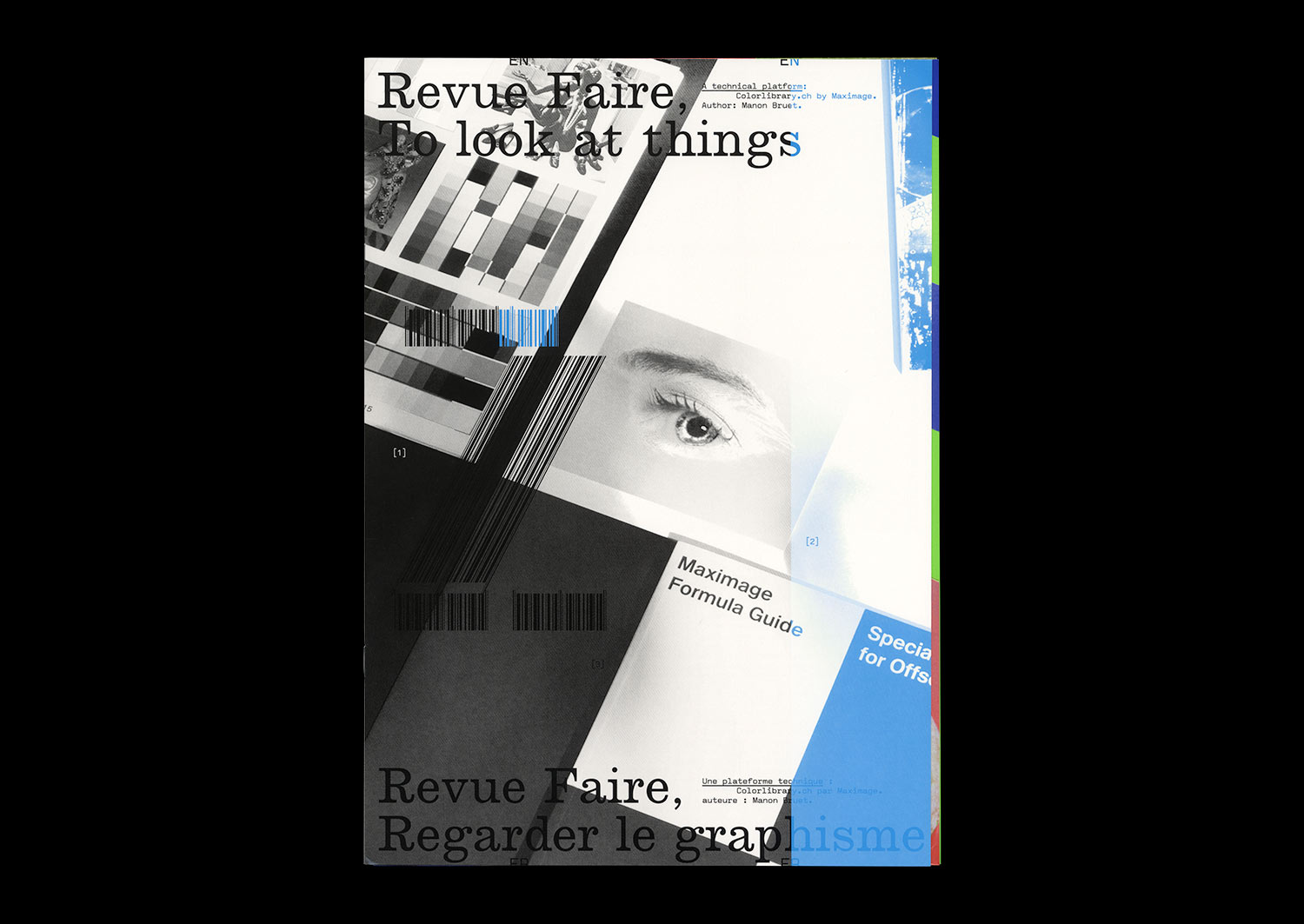
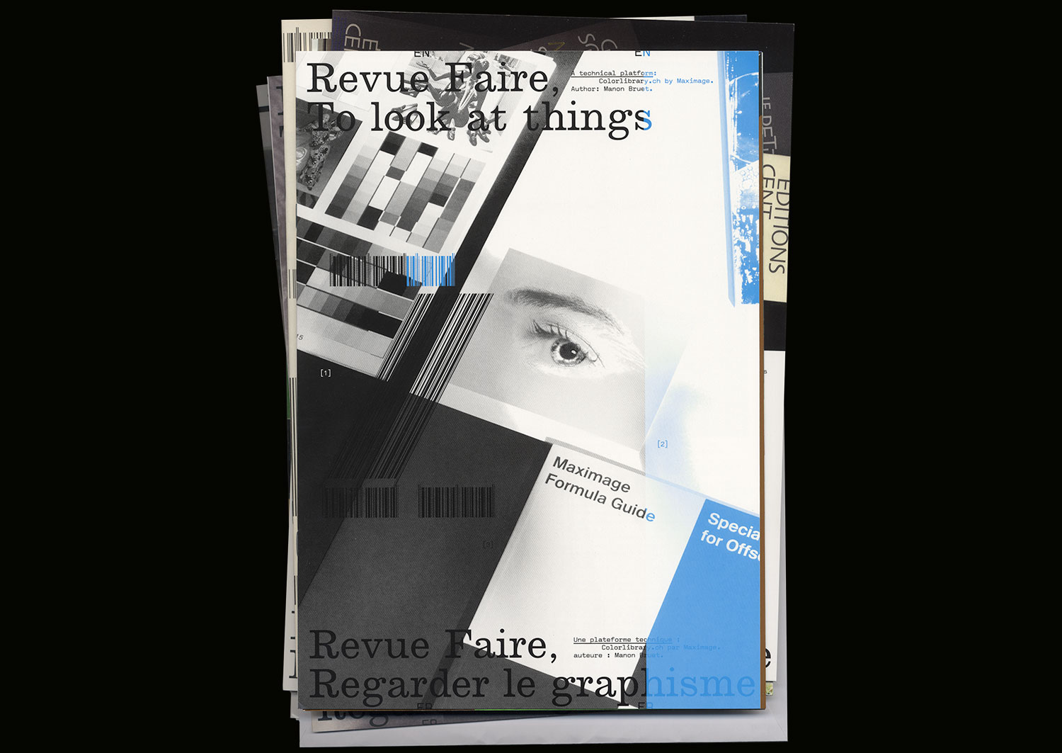
n°02 — A technical platform: Colorlibrary.ch by Maximage. Author: Manon Bruet
Author: Manon Bruet.
8th November 2017
ISBN: 979-10-95991-04-5
ISSN: 2558-2062
Author: Manon Bruet.
8th November 2017
ISBN: 979-10-95991-04-5
ISSN: 2558-2062
The Workflow research project, run by Tatiana Rhis, Guy Meldem, and Julien Tavelli and David Keshavjee (Maximage) at the Écal, is interested in current technologies of the printed object. It consists of a series of experiences that attempt to circumvent currently available production technologies, provoking coincidences and accidents with the goal of obtaining new outcomes.
More than simply questioning the possible circumvention of tools, Workflow explores technicality, modes of functioning, and flaws. In this way, the programme pursues the field of experimentation opened up by the Swiss studio Maximage since 2008. In the context of their degree project at the Écal, Julien Tavelli and David Keshavjee already combined manual and digital techniques so as to develop their own production tools, and notably their own printing methods. From their experiments have emerged, among other things, the Programme typeface, and the Les impressions magiques publication, that appears today as a manifest object of their approach.
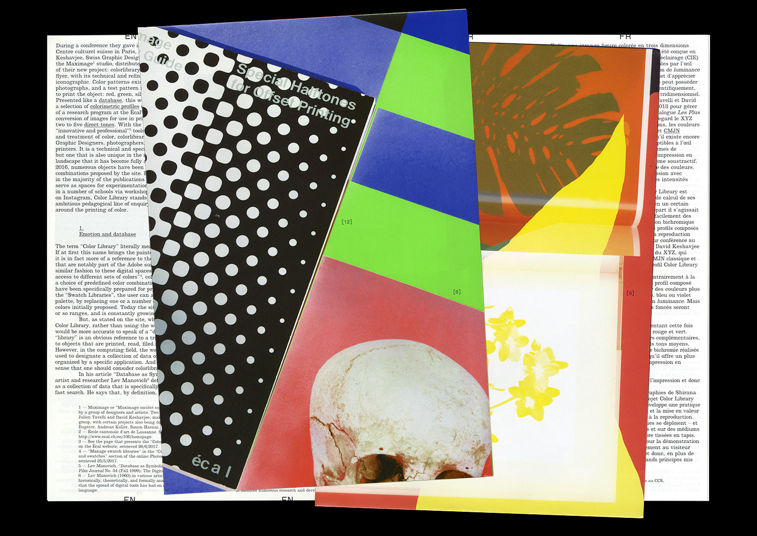
One of the first results of the Workflow programme has been the creation of a series of colorimetric profiles that allows the conversion of digital images for printing with one, two, three, four, or five accompanying colors, whether they are basic (CMYK), pastels, fluorescent, or metallic.
The work on these profiles has two aims. It serves to increase the awareness of students at the Écal with regard to the management and theory of color, but it also allows, for the first time, the automation of operations and settings that have until now been done on a case-by-case basis through the manual use of image-editing software and CAD.
Advocating an “innovative” and “professional” solution for the treatment of color, the Écal and the Workflow programme launched the website colorlibrary.ch in 2016 and offered the profiles for sale. The platform appears as an online library that presents a large variety of profiles with different colorful combinations. The different profiles are displayed on screen, applied to images by Iranian photographer Shirana Shahbazi; they seem to replay the codes of Photoshop type images–from the butterfly to the eye, the still life to the waterfall.
Beginning with an analysis of the structure of this platform, the aesthetic and terminological languages that it summons, and their limits, we will open a number of fields of investigation, more widely linked to the question of the tools and modes of production of images.
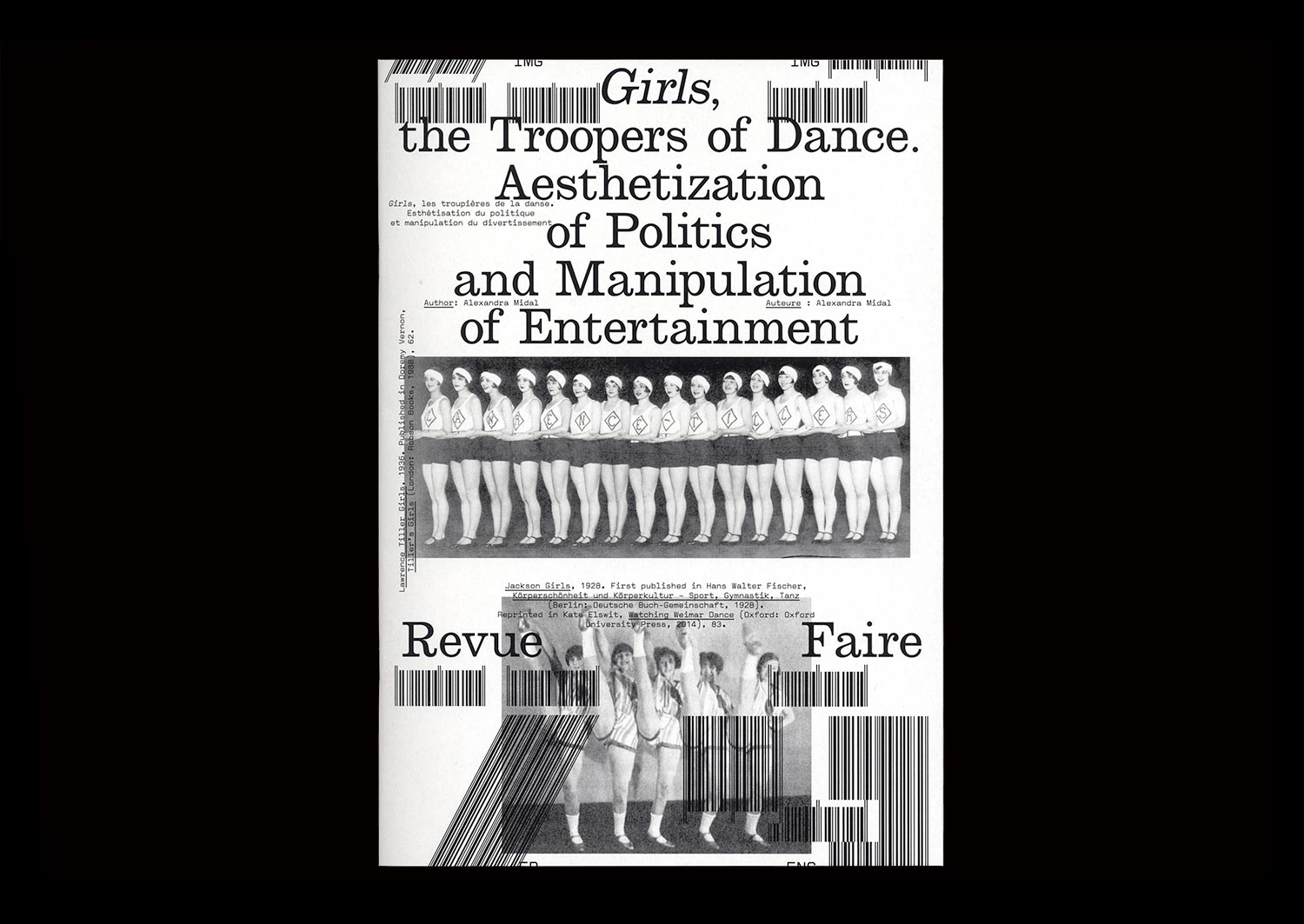
n°29 — Girls, the Troopers of Dance. Aesthetization of Politics and Manipulation of Entertainment. Author: Alexandra Midal
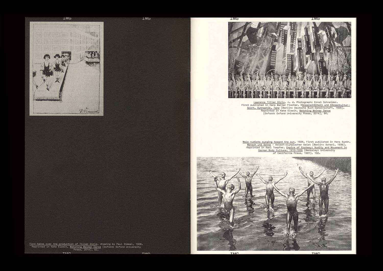
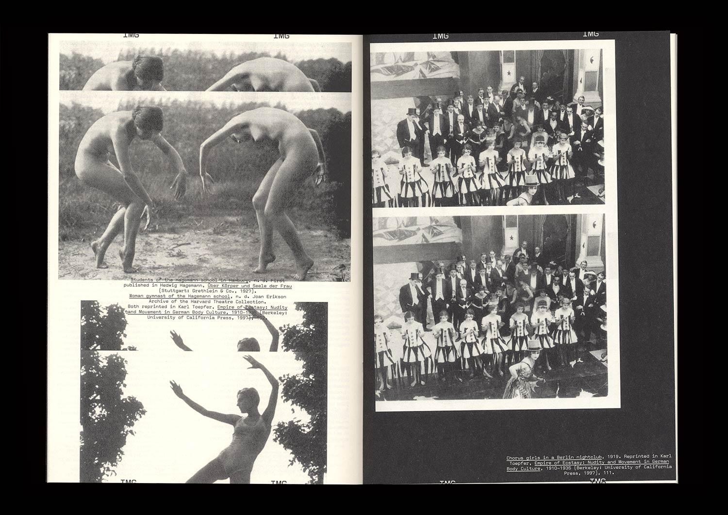
The British origins of synchronized dancing—invented in 1880 by John Tiller in a cotton mill—were quickly forgotten in Berlin, where periodicals established themselves as the expression of standardization and American capitalism. The famous Tiller Girls had become the modern figure of the “New Woman”, performing in shows attracting more than four million spectators each year. A seduced Hitler asked for his own troupe: the Hiller Girls. Face to face, both periodicals look like strictly indistinguishable replicas, apart from their opposite messages.
Synchronized dancing revealed the democratic and fascist forms given to the political discourse of the Weimar Republic when the NSDAP seized power. Between the power of forms and forms of power, amid the destruction of cities, decrees banishing the use of Fraktur, and the destruction of degenerate art, those dance shows, undoubtedly because of their popularity, showed that National Socialism was using insidious and invisible strategies to empty forms of their content only to maintain their appearance intact, thus revealing a shadow practice that, in the end, turned out to be just as barbaric as world-wide destruction or the burning of books.
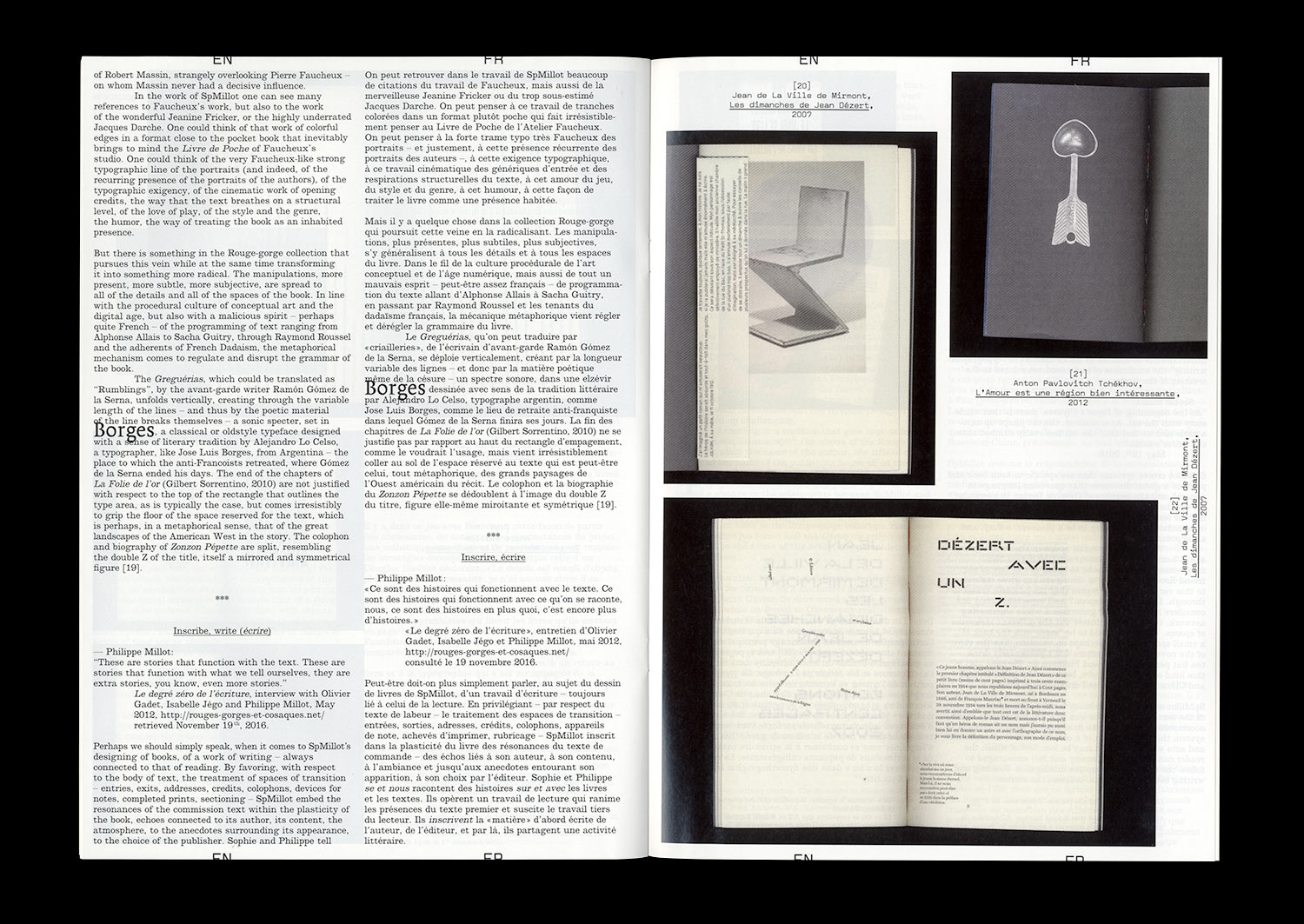
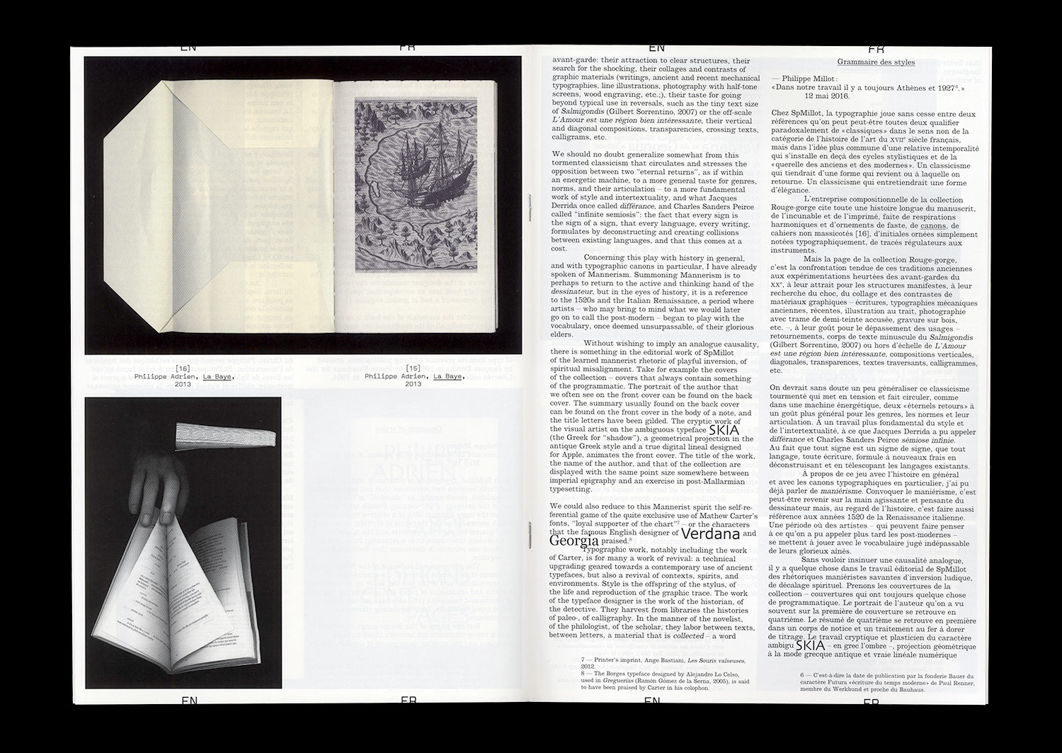
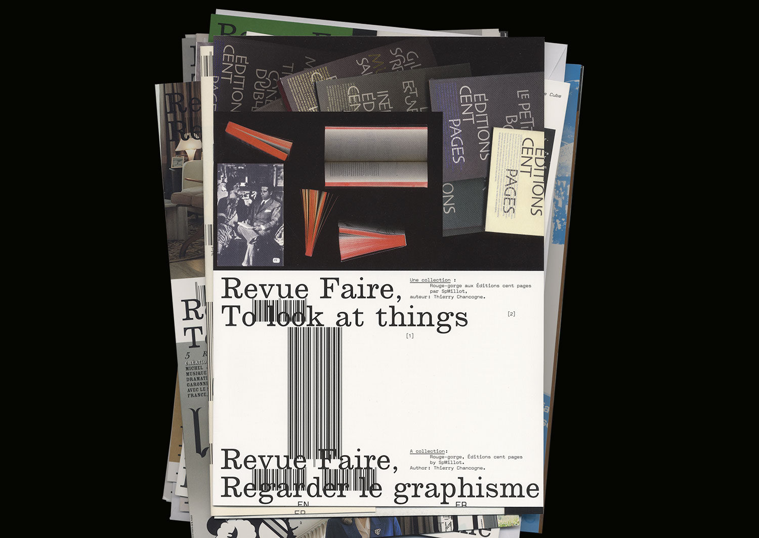
n°01 — A collection: Rouge-gorge, Éditions Cent pages by SpMillot. Author: Thierry Chancogne
Author: Thierry Chancogne.
20 pages, 21 × 29,7 cm, CMYK
25th Octobre 2017
ISBN: 979-10-95991-04-5
ISSN: 2558-2062
Out of stock
Author: Thierry Chancogne.
20 pages, 21 × 29,7 cm, CMYK
25th Octobre 2017
ISBN: 979-10-95991-04-5
ISSN: 2558-2062
Available only with the Season 1 subscription