n°41 — Manuel Raeder. Author: Kiki Mazzucchelli
n°41 — Manuel Raeder. Author: Kiki Mazzucchelli
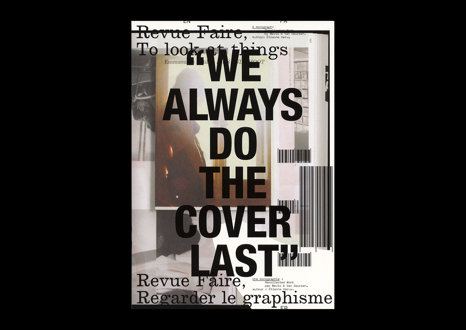
n°03 — A monograph: Recollected Work by Mevis & van Deursen. Author: Étienne Hervy
Author: Étienne Hervy.
20 pages, 21 × 29,7 cm, CMYK
22th November 2017
ISBN: 979-10-95991-04-5
ISSN: 2558-2062
Author: Étienne Hervy.
20 pages, 21 × 29,7 cm, CMYK
22th November 2017
ISBN: 979-10-95991-04-5
ISSN: 2558-2062
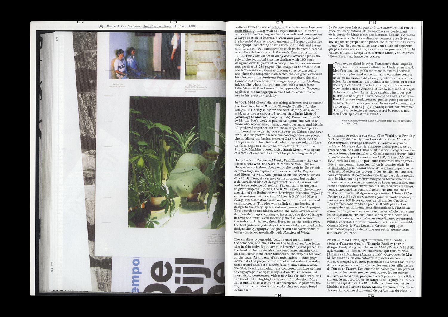
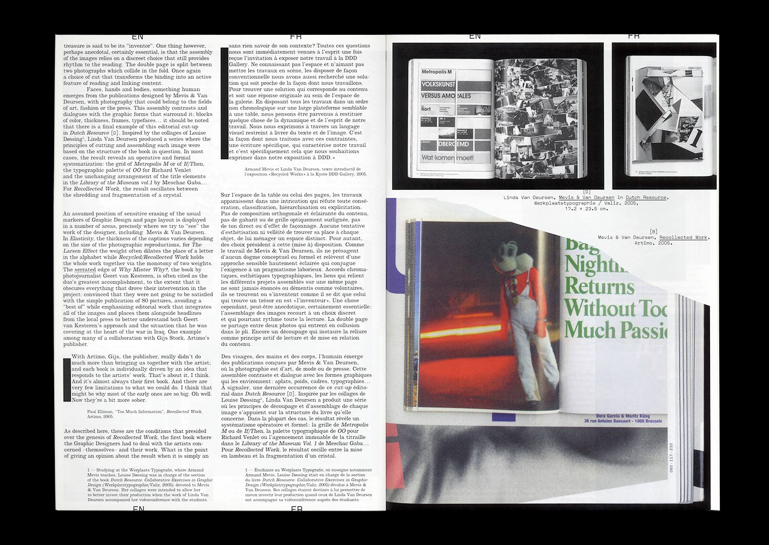
In 2006, the publisher Artimo entrusted Linda van Deursen and Armand Mevis with the editorial direction and the Graphic Design of their own monograph, Recollected Works. Joined by Paul Elliman in writing the texts, the two Graphic Designers responded with an approach similar to that which they adopt when they accompany other artists and photographers in the creation of books whose relevance has largely contributed to the studio’s reputation. Mevis and van Deursen propose to the reader to experience their work in operation, rather than simply contenting themselves with the reproduction of the work presented as artworks in themselves. Rather than the nostalgia for a more or less formalized organization of their previous projects, the two Graphic Designers look at their previous work as the material for an autonomous project from which this book will emerge.
Such a choice directly raises the question of the constitution and transmission of a culture inherent to Graphic Design, whether it isspecifically aimed at designers or else at a much wider audience. How to transmit the issues and points of quality of a discipline itself dedicated to transmission? One must above all recognize the capacity of this eminently visual field to confront appearances.
Our study of this work will obviously reference a corpus of monographs and publications made by Graphic Designers (Christophe Jacquet, Joost Grootens, M/M (Paris), Karel Martens, Experimental Jetset, Wolgang Weingart, etc.) while at the same time looking more widely at the forms currently adopted for the transmission of Graphic Design (exhibitions, conferences, etc.). Beyond the issues discussed and the questions raised by Recollected Works, it is a matter of both pulling on the thread of the work of Mevis and van Deursen (does a continuity exist between the editorial design of Why Mister, Why? for Geert van Kesteren or the Library Of The Museum Museum of Contemporary African Art for Meschac Gaba, and the identity of the Stedelijk Museum?) and questioning the pertinence of a discourse specific to Graphic Design.
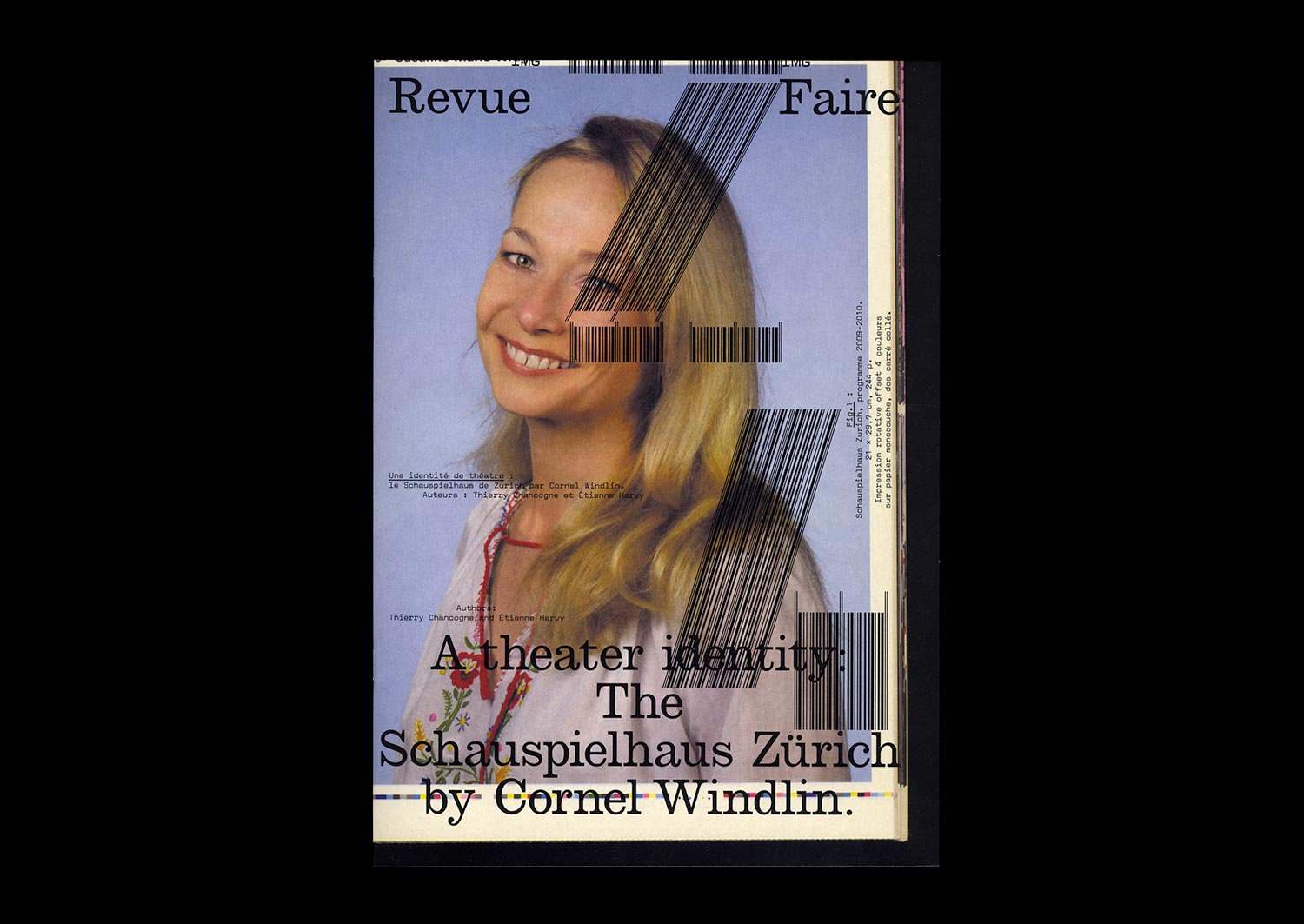
n°24 — A theater identity: The Schauspielhaus Zürich by Cornel Windlin. Authors: Étienne Hervy and Thierry Chancogne
Authors: Étienne Hervy and Thierry Chancogne
36 pages, 21 × 29,7 cm, CMYK
23th September 2020
ISBN: 979-10-95991-17-5
ISSN: 2558-2062
Authors: Étienne Hervy and Thierry Chancogne
36 pages, 21 × 29,7 cm, CMYK
23th September 2020
ISBN: 979-10-95991-17-5
ISSN: 2558-2062
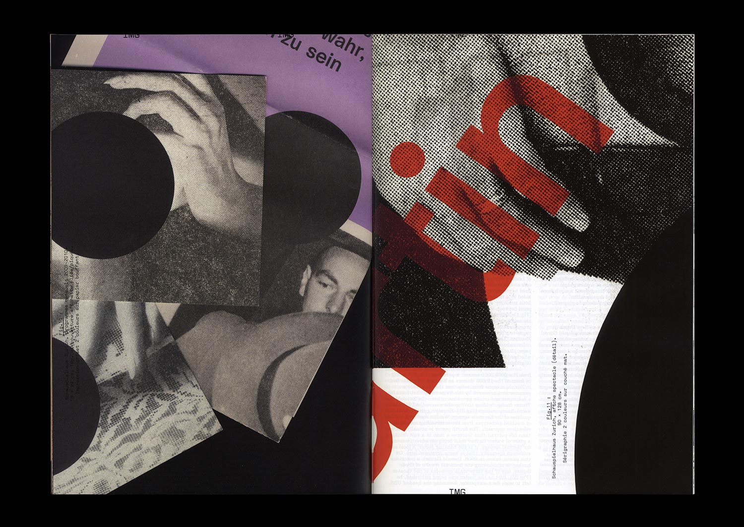
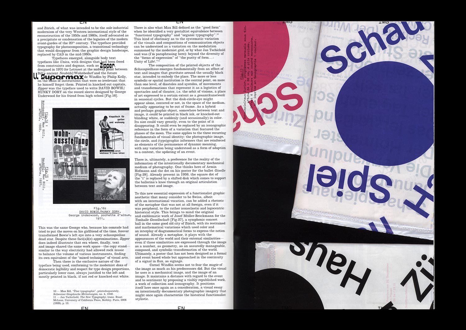
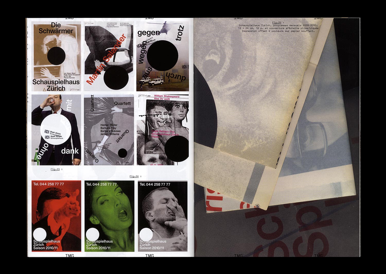
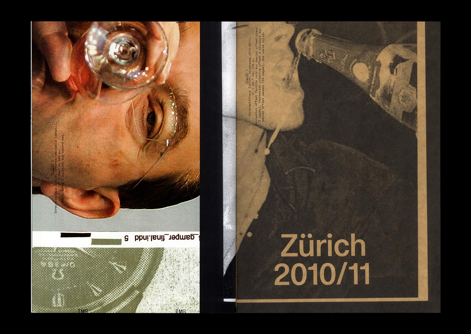
Designed by Cornel Windlin (with Gregor Huber), the communications of the Zürich Schauspielhaus for the 2009/10 and 2010/11 seasons appeared just as the collaboration between the designers and the theater ended: with the Grand Prix of the Brno Biennial in 2010, where they won first prize in the international competition, with an exhibition in Chaumont the following year at the same time as the Swiss Federal Design Award, a brief appearance in specialist magazines and on specialist sites, and then nothing at all. Once again, Cornel Windlin retreated into the shadows, leaving behind work which asserted itself through both its amplitude and completeness in the heavy silence which remained, and through the multifaceted mass of the media imagery that it reactivated. A series of seasonal posters, event posters, annual and monthly programs, booklets dedicated to each piece, invitations, flyers, graphic materials from the program for younger audiences… everything is here, set in a precisely tuned bold Unica77, digitized by the Lineto foundry with the original team of designers (along with Windlin), all coming together in that blindness inherent to times of eclipse, where the black disk chosen by Windlin as the identity of the Schauspielhaus stands out. Now, a decade later, the idea is to propose a meticulously organized reception, informed by Cornel Widlin and placed in a cavalier perspective by the analysis of Thierry Chancogne.
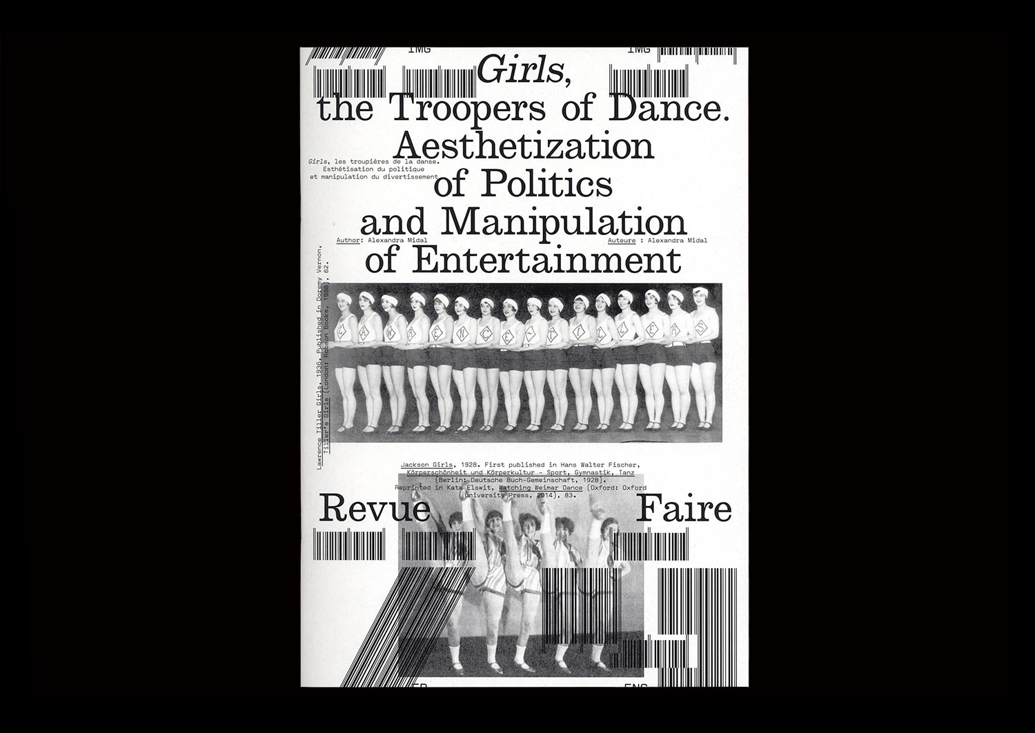
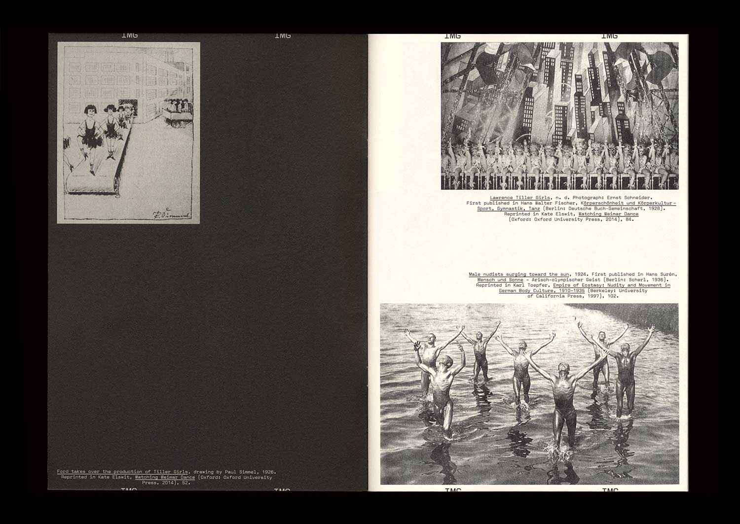
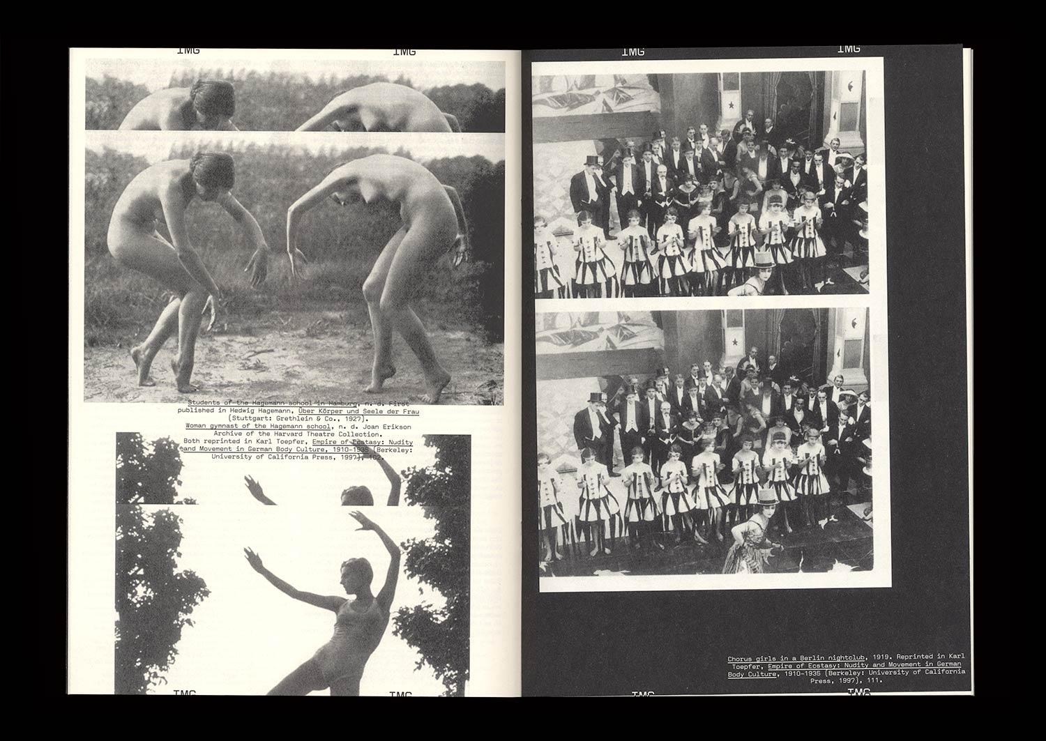
n°29 — Girls, the Troopers of Dance. Aesthetization of Politics and Manipulation of Entertainment. Author: Alexandra Midal
The British origins of synchronized dancing—invented in 1880 by John Tiller in a cotton mill—were quickly forgotten in Berlin, where periodicals established themselves as the expression of standardization and American capitalism. The famous Tiller Girls had become the modern figure of the “New Woman”, performing in shows attracting more than four million spectators each year. A seduced Hitler asked for his own troupe: the Hiller Girls. Face to face, both periodicals look like strictly indistinguishable replicas, apart from their opposite messages.
Synchronized dancing revealed the democratic and fascist forms given to the political discourse of the Weimar Republic when the NSDAP seized power. Between the power of forms and forms of power, amid the destruction of cities, decrees banishing the use of Fraktur, and the destruction of degenerate art, those dance shows, undoubtedly because of their popularity, showed that National Socialism was using insidious and invisible strategies to empty forms of their content only to maintain their appearance intact, thus revealing a shadow practice that, in the end, turned out to be just as barbaric as world-wide destruction or the burning of books.