n°44 — Four Templates. Author: Stuart Bertolotti-Bailey
n°44 — Four Templates. Author: Stuart Bertolotti-Bailey
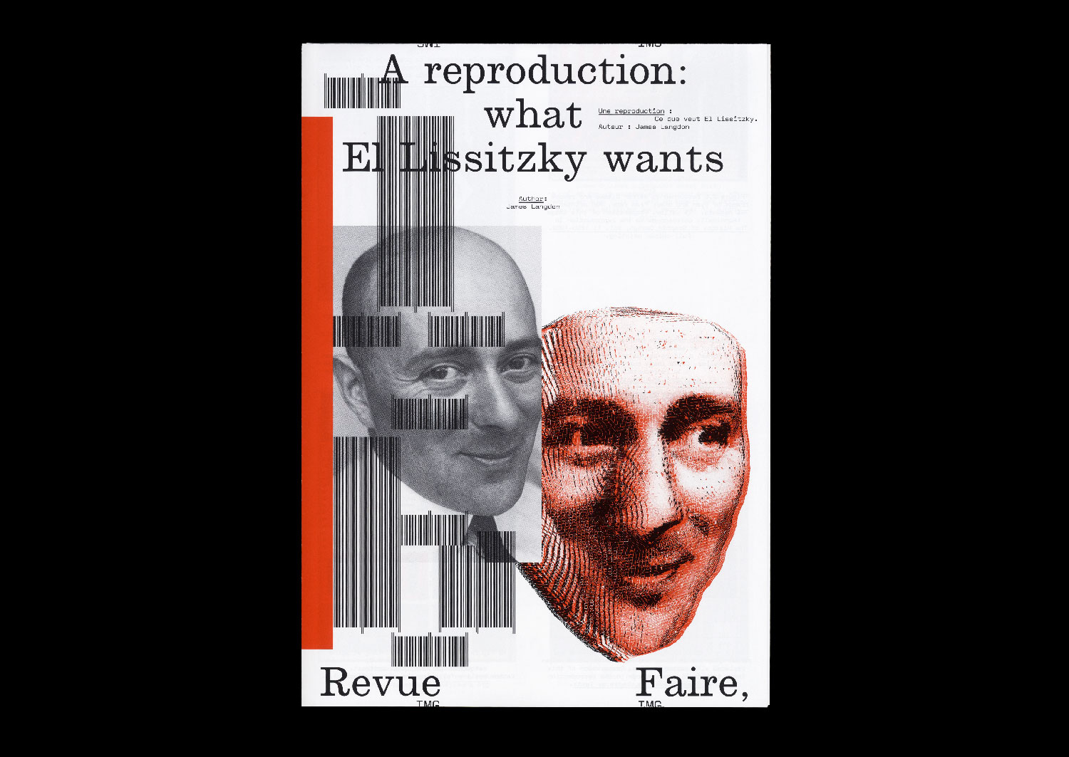
16 — A reproduction: what El Lissitzkzy wants. Author: James Langdon
Author: James Langdon
20 pages, 21 × 29,7 cm, CMYK+1PMS
7th November 2019
ISBN: 979-10-95991-15-1
ISSN: 2558-2062
Author: James Langdon
20 pages, 21 × 29,7 cm, CMYK+1PMS
7th November 2019
ISBN: 979-10-95991-15-1
ISSN: 2558-2062
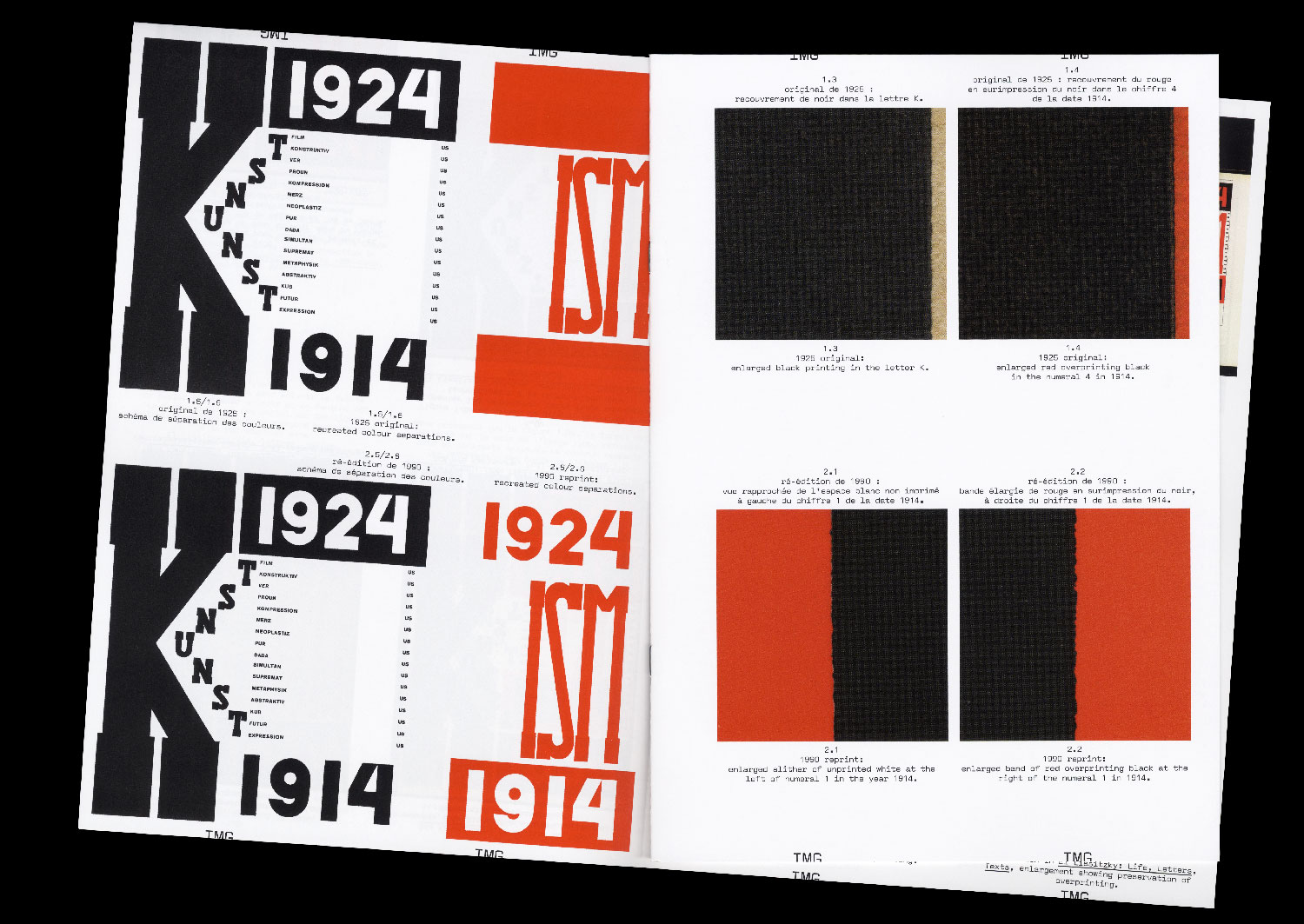
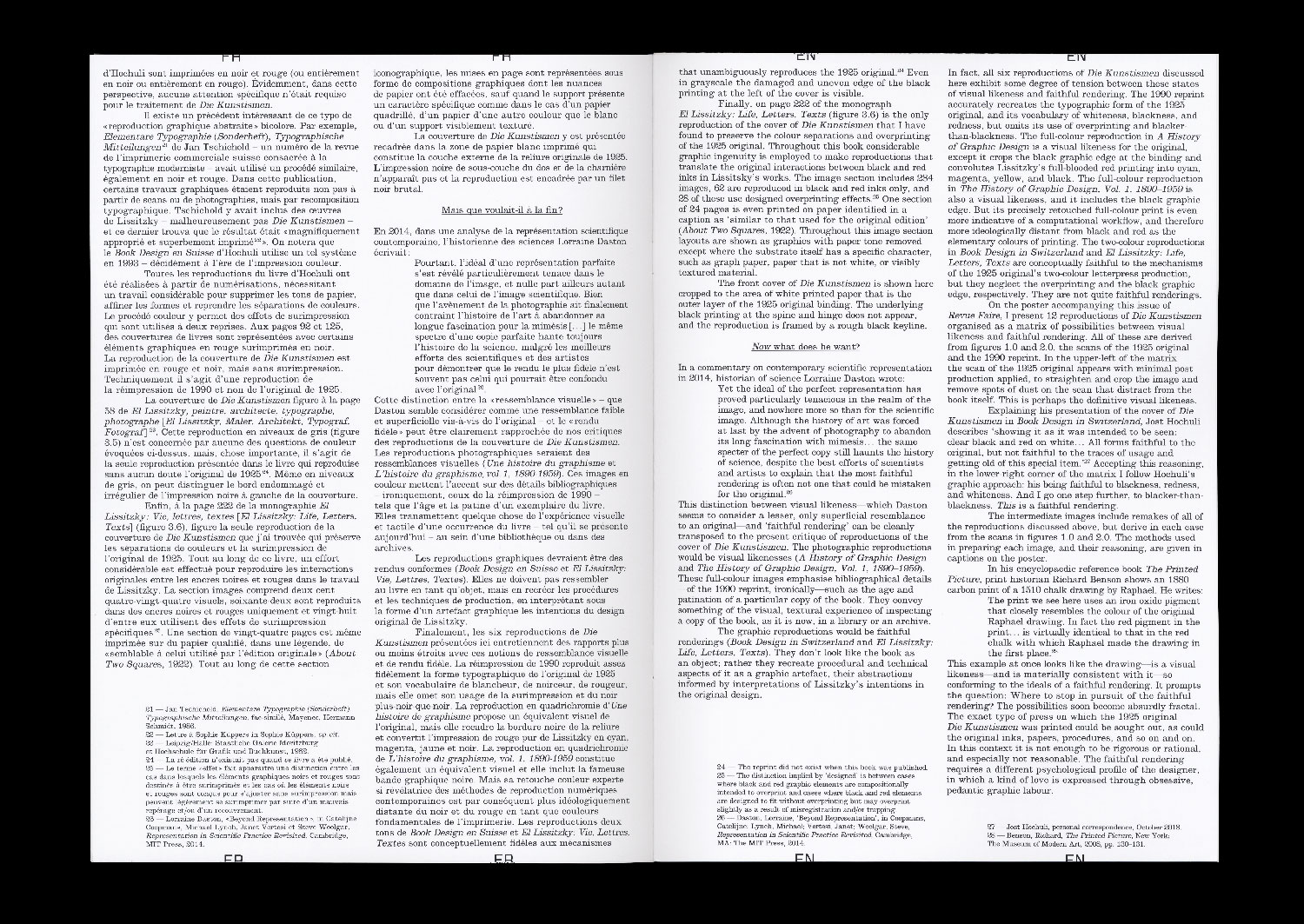
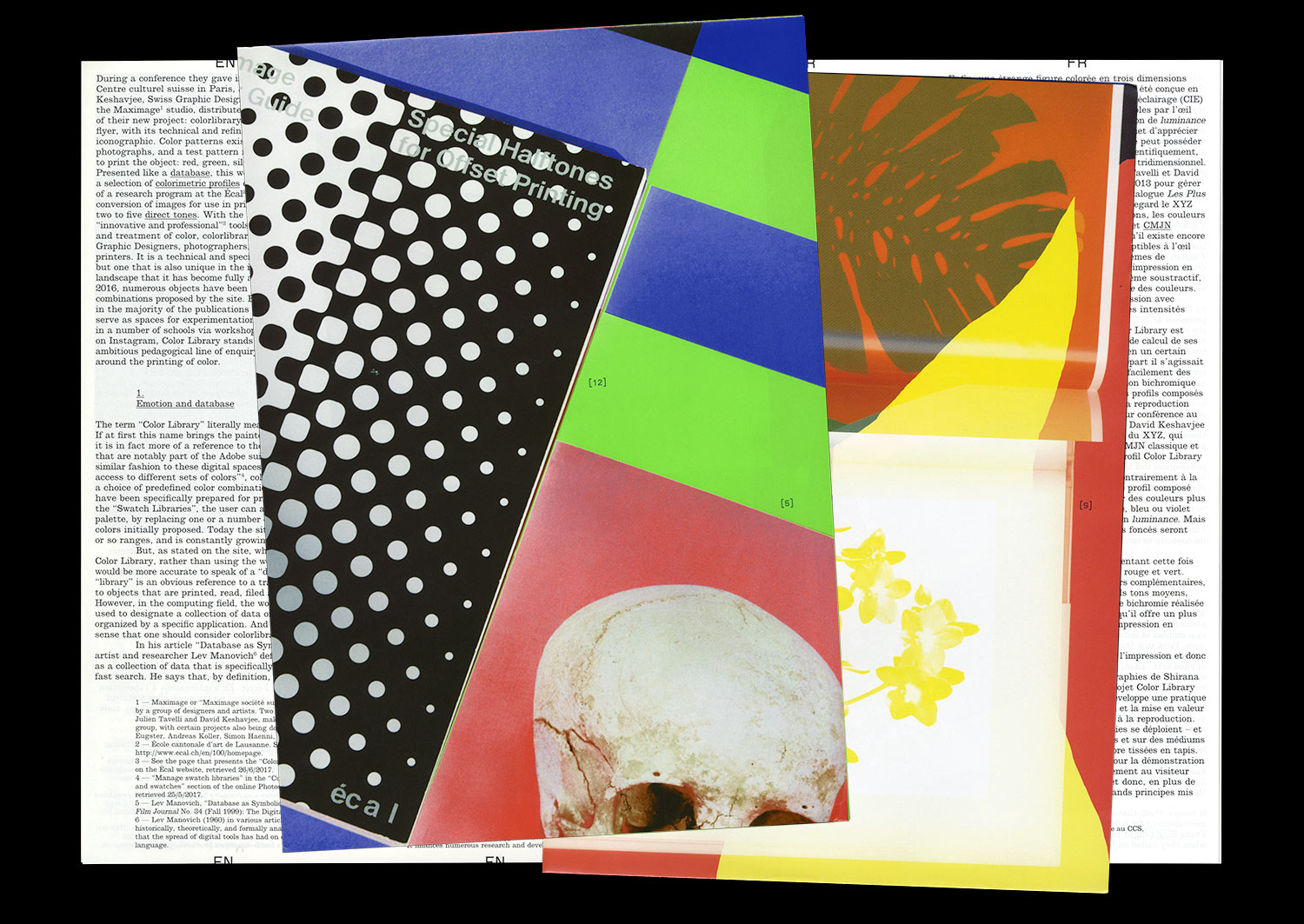
I am rarely convinced when I see graphic design that was originally printed in two inks reproduced in four- colour process. Before the advent of commercial colour offset printing, the elementary colours of printing — from Gutenberg to Tschichold — were black and red. In the early twentieth century, black and red were used by graphic designers not to attempt to recreate the spectrum of colours that appear to the human eye, but as graphic forces in themselves. To make a distinction. To create dynamism. To embody ideology on the page. In particular, the combination of black and red on white paper has become synonymous with Suprematism and revolutionary Russian graphic design.
A contemporary imaging workflow can enable extraordinary reproductions of these historical aesthetics. A high- resolution digital photograph of an original black and red printed book from the 1920s can be processed using a colour profile to calibrate its appearance across design, colour correction in computer software, proofing, and printing. This workflow can ultimately achieve a beautiful and precise image of that graphic artefact as it looks today, down to small details of its patination, its discoloration by exposure to sunlight, and the many more other subtleties that define it as an archival object.
But such a reproduction exhibits a strange technical anachronism. What about the constraints that originally shaped the design of that bookk — the implicit connection between the two colours of its graphics and the architecture of the one- or two-colour printing press on which it was printed? Are they not important? Can they even be reproduced?
I compare printed reproductions of the proud black and red cover of the book ‘Die Kunstismen’ (1925), designed by Russian artist and designer El Lissitzky. Published between 1967 and 2017, these images treat the material characteristics of the original book’s colour in different ways, appealing to contradictory notions of fidelity.
n°04 — A communication: invitation cards by the artist Stanley Brouwn. Author: Céline Chazalviel
n°04 — A communication: invitation cards by the artist Stanley Brouwn.
Author: Céline Chazalviel.
20 pages, 21 × 29,7 cm, CMYK
6th December 2017
ISBN: 979-10-95991-04-5
ISSN: 2558-2062
n°04 — A communication: invitation cards by the artist Stanley Brouwn.
Author: Céline Chazalviel.
20 pages, 21 × 29,7 cm, CMYK
6th December 2017
ISBN: 979-10-95991-04-5
ISSN: 2558-2062
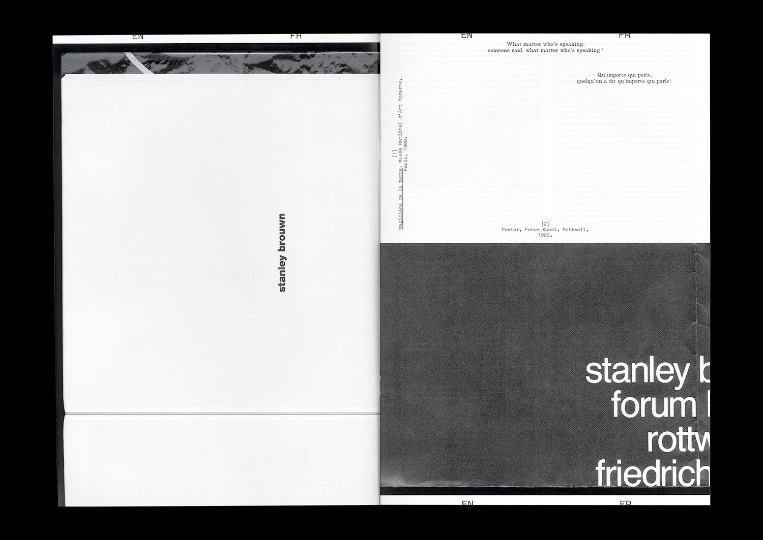
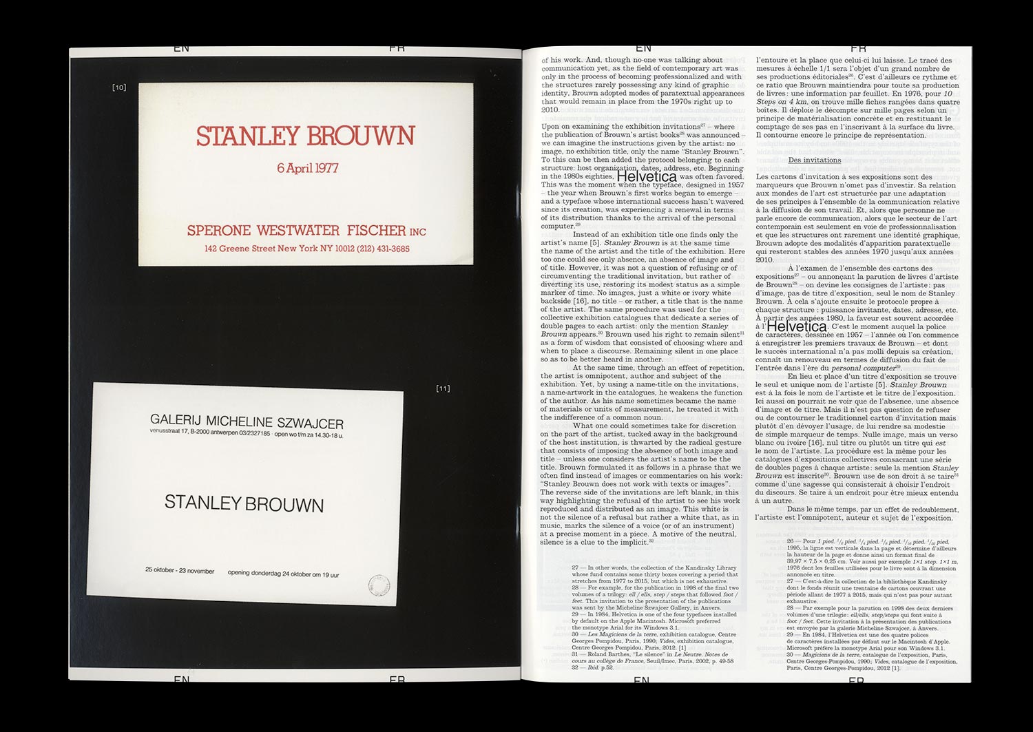
If we could attribute to Stanley Brouwn a desire to dissociate his artistic production from who he is and to reveal otherness through the mastery of his image and that of his work, we could also divine an intention to focus the public’s attention on his exhibitions. Behind the standards put in place for the communication related to his exhibitions—the use of lowercase and Helvetica exclusively, the refusal to reproduce images of his work, to produce (or allow production of) written commentary on the subject of the same work, to appear in the context of a vernissage or even to answer an interview—the artist builds his identity by way of ellipses. Since his participation in documenta 5 (1972), the stories linked to this attitude have come to draw the outlines of an artistic posture that goes beyond any one particular case. The invitation cards for his solo exhibitions provide a symptomatic example: set almost exclusively in Helvetica, the absence of uppercase, flying in the face of the graphic identity of the gallery or the host institution, they seem impossible to date, give or take twenty years.
This mastery reveals that graphic and typographic choices represent one of the spaces of neutrality built by Brouwn, like other artists and theoreticians of his generation, and generations that came after. According to one of the positions of Sol Lewitt, “conceptual artists are more mystical than rationalist,” and the case of Brouwn gives weight to this idea. Whether it be by way of a mediation adopted by the artist himself and the relationship with the institution that it entails, that of the myth of the autonomy of the artwork, of the relationship with documentation, with commentary and the analysis of an artwork or even the conditions of reception, Brouwn escapes the category of the conceptual artist and incites us to measure the contemporary echoes of his radicality.
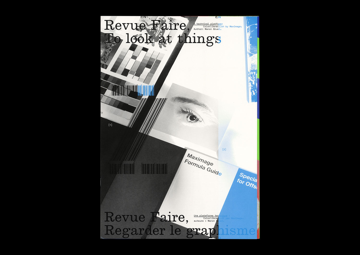
n°02 — A technical platform: Colorlibrary.ch by Maximage. Author: Manon Bruet
Author: Manon Bruet.
8th November 2017
ISBN: 979-10-95991-04-5
ISSN: 2558-2062
Author: Manon Bruet.
8th November 2017
ISBN: 979-10-95991-04-5
ISSN: 2558-2062
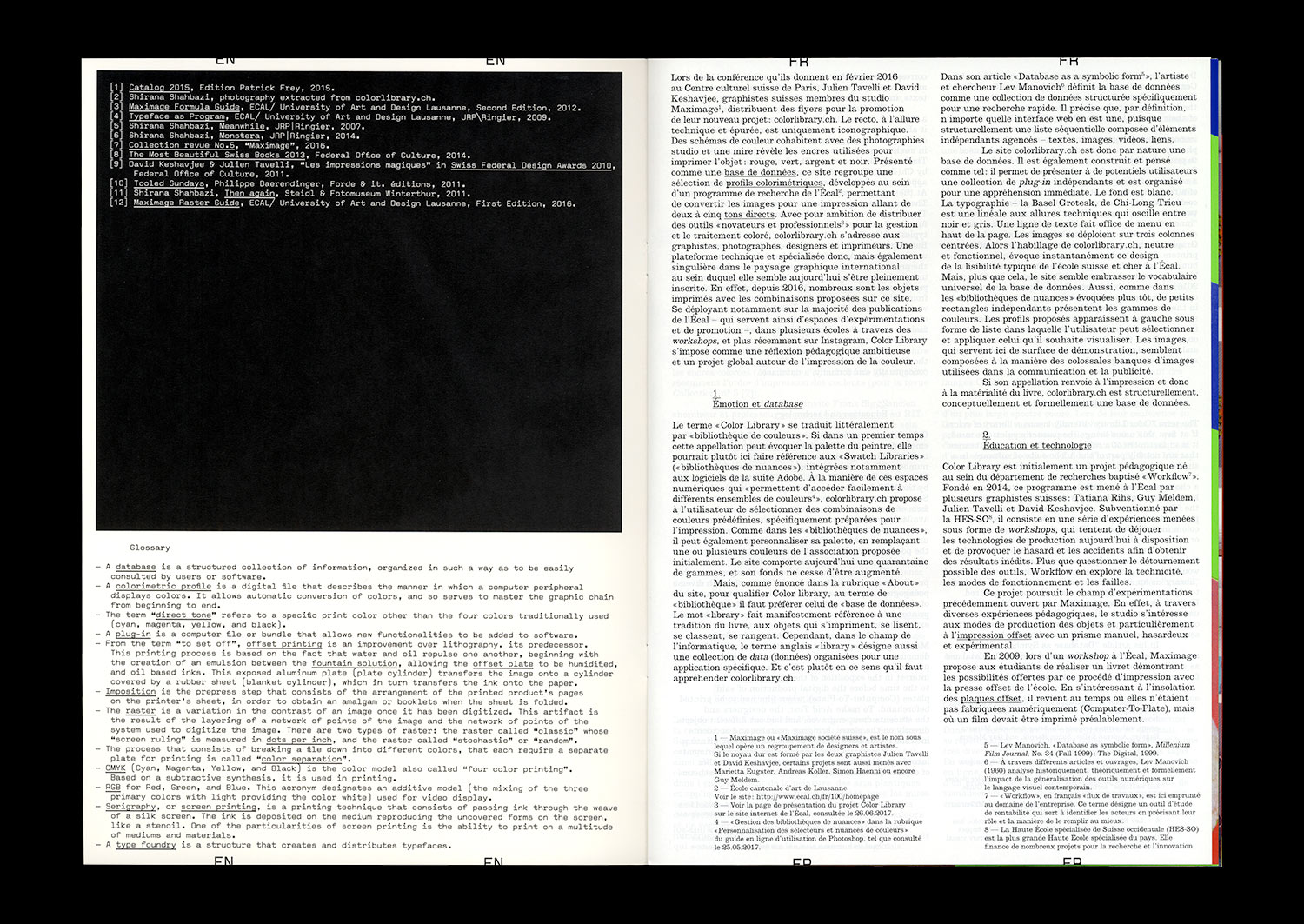
The Workflow research project, run by Tatiana Rhis, Guy Meldem, and Julien Tavelli and David Keshavjee (Maximage) at the Écal, is interested in current technologies of the printed object. It consists of a series of experiences that attempt to circumvent currently available production technologies, provoking coincidences and accidents with the goal of obtaining new outcomes.
More than simply questioning the possible circumvention of tools, Workflow explores technicality, modes of functioning, and flaws. In this way, the programme pursues the field of experimentation opened up by the Swiss studio Maximage since 2008. In the context of their degree project at the Écal, Julien Tavelli and David Keshavjee already combined manual and digital techniques so as to develop their own production tools, and notably their own printing methods. From their experiments have emerged, among other things, the Programme typeface, and the Les impressions magiques publication, that appears today as a manifest object of their approach.
One of the first results of the Workflow programme has been the creation of a series of colorimetric profiles that allows the conversion of digital images for printing with one, two, three, four, or five accompanying colors, whether they are basic (CMYK), pastels, fluorescent, or metallic.
The work on these profiles has two aims. It serves to increase the awareness of students at the Écal with regard to the management and theory of color, but it also allows, for the first time, the automation of operations and settings that have until now been done on a case-by-case basis through the manual use of image-editing software and CAD.
Advocating an “innovative” and “professional” solution for the treatment of color, the Écal and the Workflow programme launched the website colorlibrary.ch in 2016 and offered the profiles for sale. The platform appears as an online library that presents a large variety of profiles with different colorful combinations. The different profiles are displayed on screen, applied to images by Iranian photographer Shirana Shahbazi; they seem to replay the codes of Photoshop type images–from the butterfly to the eye, the still life to the waterfall.
Beginning with an analysis of the structure of this platform, the aesthetic and terminological languages that it summons, and their limits, we will open a number of fields of investigation, more widely linked to the question of the tools and modes of production of images.