n°45 — Hans Rudolf Lutz: To Lutz at things. Authors: Olivier Lebrun, Urs Lehni and Tania Prill
n°45 — Hans Rudolf Lutz: To Lutz at things. Authors: Olivier Lebrun, Urs Lehni and Tania Prill
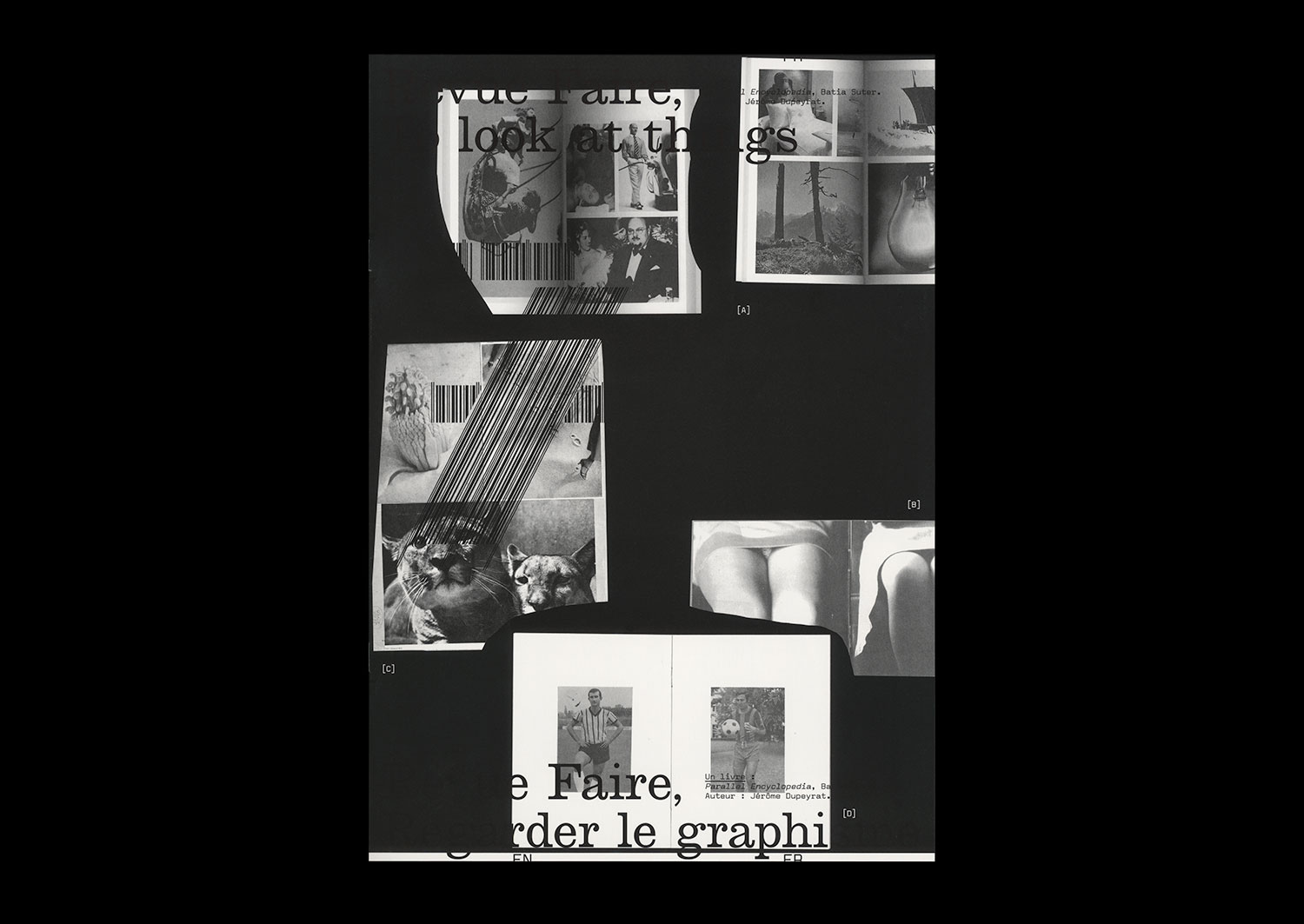
n°07 — A book: Parallel Encyclopedia, Batia Suter. Author: Jérôme Dupeyrat
Author: Jérôme Dupeyrat.
20 pages, 21 × 29,7 cm, CMYK
24 January 2018
ISBN: 979-10-95991-05-2
ISSN: 2558-2062
Author: Jérôme Dupeyrat.
20 pages, 21 × 29,7 cm, CMYK
24 January 2018
ISBN: 979-10-95991-05-2
ISSN: 2558-2062
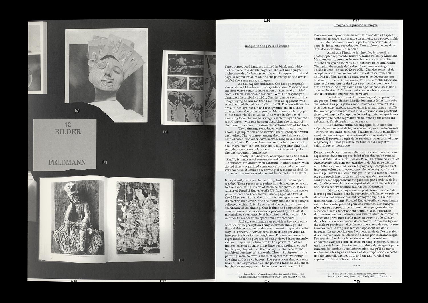
Since the end of the 1990s, Batia Suter has been collecting books—second hand for the most part—that she acquires for their iconography, in such a way as to build up an image database that sits on the shelves of her personal library. All of this has become the basic material for an artwork that consists of presenting the images according to a logic of visual editing, providing them with new modalities of appearance and thus new possibilities of interpretation.
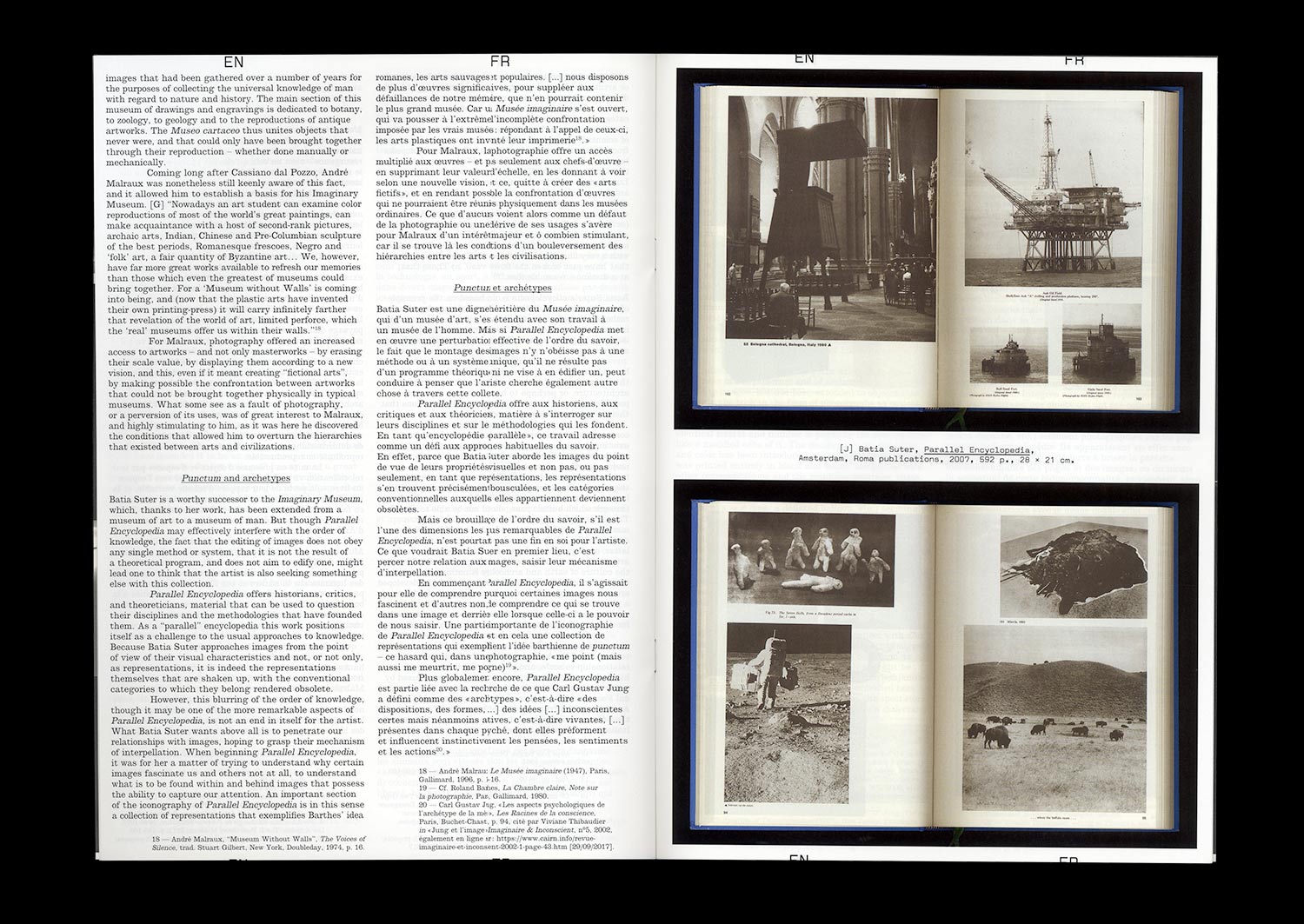
Parallel Encyclopedia is, at the time of writing, the artist’s most significant work. Ongoing since 2004, it has taken the form of a number of installations and two imposing publications from Roma Publications published in 2007 and 2016. Each version of the project is characterized by the association of hundreds of heteroclite images (historical, artistic, scientific, and technical), grouped according to typological and formal links. From one system to another, the conditions of presentation of these images taken from books are renewed: the sequencing and seriality of bound pages; constellations or, on the contrary, linear sequences of images reproduced and exhibited on wall panels; constellations or linear sequences of book pages opened and placed on flat mounts. Though the exhibited images are the same, these various exhibition possibilities determine differential readings.
Beyond the fascination that such a project can generate, this text will attempt to seize all of its complexity. To do this, Batia Suter’s work will be re-situated within the context of a history of iconographic practices that run through different fields of activities and knowledge. We will also focus on the trajectory of the images gathered in Parallel Encyclopedia and the effects of the process of remediation to which they are subjected. Ultimately, it will be a question of drawing a figure of the artist as an “editor” and of studying both the function of Graphic Design in the artist’s work and the place that we can attribute to the artist in the field of Graphic Design, a field to which Batia Suter doesn’t directly belong, but one that runs through her productions, and to which she was confronted in a concrete fashion in the context of her collaboration with the Graphic Designer Roger Willems in the design of the two volumes of the encyclopedia that, in fact, is today a reference for many artists, as much as it is for a large number of Graphic Designers.
n°05 — An Instagram post: P/Pa/Para/Paradiso by jetset_experimental (July 1 2017). Author: Manon Bruet
Author: Manon Bruet.
20 pages, 21 × 29,7 cm, CMYK
20 December 2017
ISBN : 979-10-95991-05-2
ISSN : 2558-2062
Author: Manon Bruet.
20 pages, 21 × 29,7 cm, CMYK
20 December 2017
ISBN : 979-10-95991-05-2
ISSN : 2558-2062
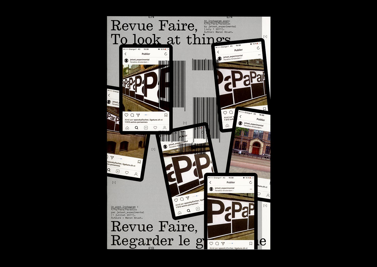
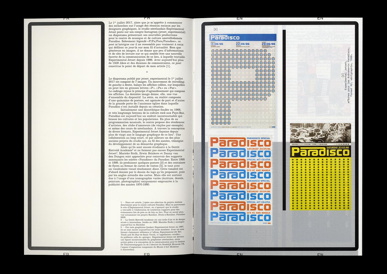
On July 1st, 2017, just as I was about to begin research into the use of social networks by Graphic Designers, the Dutch studio Experimental Jetset posted a slideshow containing 7 images on Instagram. Entitled “P/Pa/Para/Paradiso” it presented, as a whole and in its details, their new posters for the Paradiso center for music and culture in Amsterdam. Apart from the obvious formal relationship with the Blow Up poster that they created in 2007 for the London Design Museum, this slideshow gives very few keys to read what seemed to be a new aspect of the center’s communication, something that Experimental Jetset had been working on since 1996.
Currently having over 1,500 likes and tens of comments, this post is where my article begins. An opportunity to investigate and review this collaboration, that over 20 years has taken various forms (flyers, programs, posters), along with the singular and radical practice of Experimental Jetset. And also the opportunity to provide a more theoretical view of the way that Graphic Design is shown and seen on different platforms, that have now become an integral part of the teaching and the evolution of the discipline.
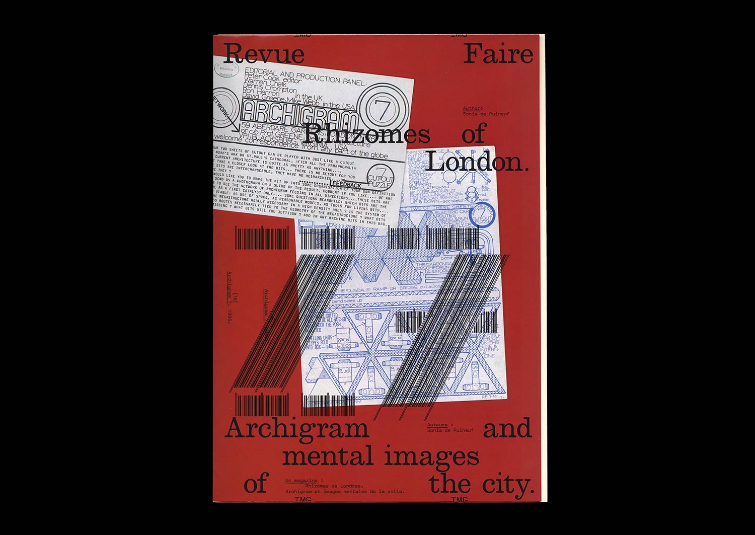
n°27 — Rhizomes of London. Archigram and mental images of the city. Author: Sonia de Puineuf
Author: Sonia de Puineuf
12 pages + A1 poster
21 × 29,7 cm, CMYK
2nd February 2021
ISBN: 979-10-95991-18-2
ISSN: 2558-2062
Author: Sonia de Puineuf
12 pages + A1 poster
21 × 29,7 cm, CMYK
2nd February 2021
ISBN: 979-10-95991-18-2
ISSN: 2558-2062
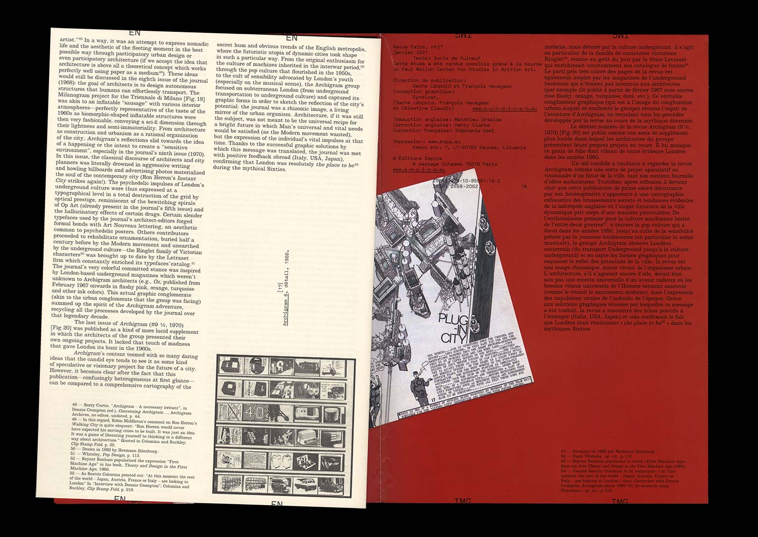
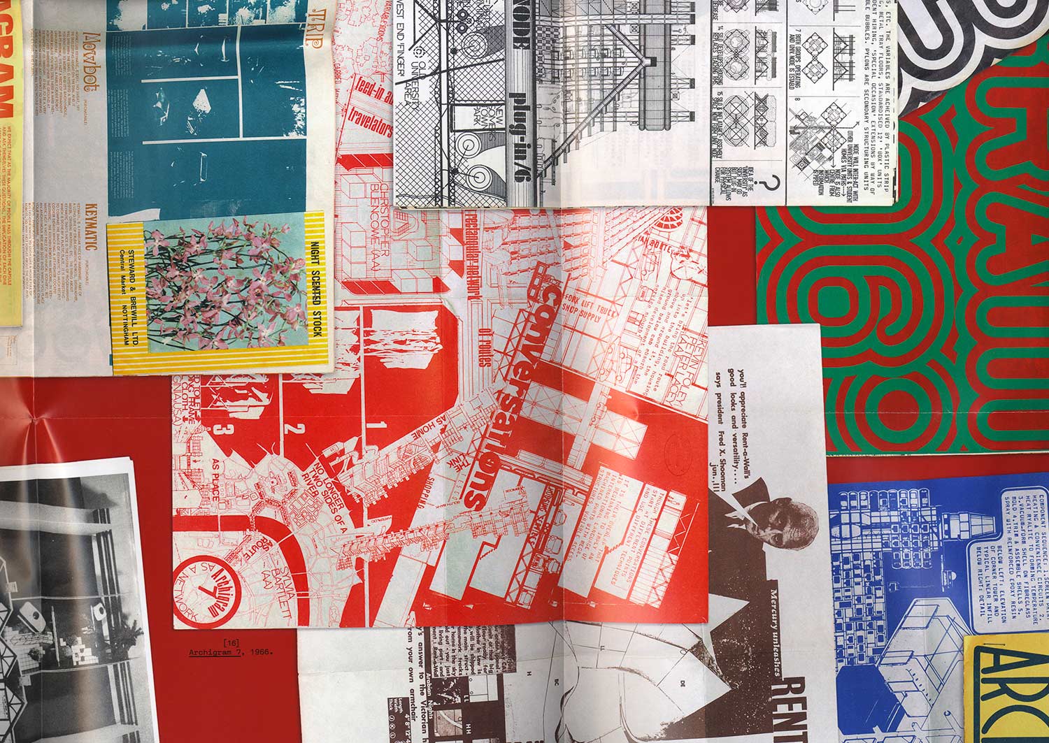
A mine of images and ideas for architectural and urban-planning practices, the journal Archigram (1961–70) has already been the subject of close reading and analysis by architects, historians, theoreticians, and architecture critics. This study approaches Archigram from a different angle, attempting to interpret it as a successful artifact of graphic design by confronting it with the achievements of its time and other inspirational eras of editorial and environmental graphic design. It aims to explain the graphical evolution of the journal through the graphical stimuli of London—the city where the Archigram architects worked on a daily basis. It is an attempt to demonstrate that the publication, at first glance confusingly heterogeneous, is akin to a comprehensive mapping of the secret whirrs and the more obvious trends of the English metropolis, where the futuristic utopia of the dynamic city took shape in such a particular way. By identifying London’s potential during the mythical Sixties, the Archigram journal stands out as a rhizomatic image, a living mirror of the urban organism.