n°41 — Manuel Raeder. Author: Kiki Mazzucchelli
n°41 — Manuel Raeder. Author: Kiki Mazzucchelli
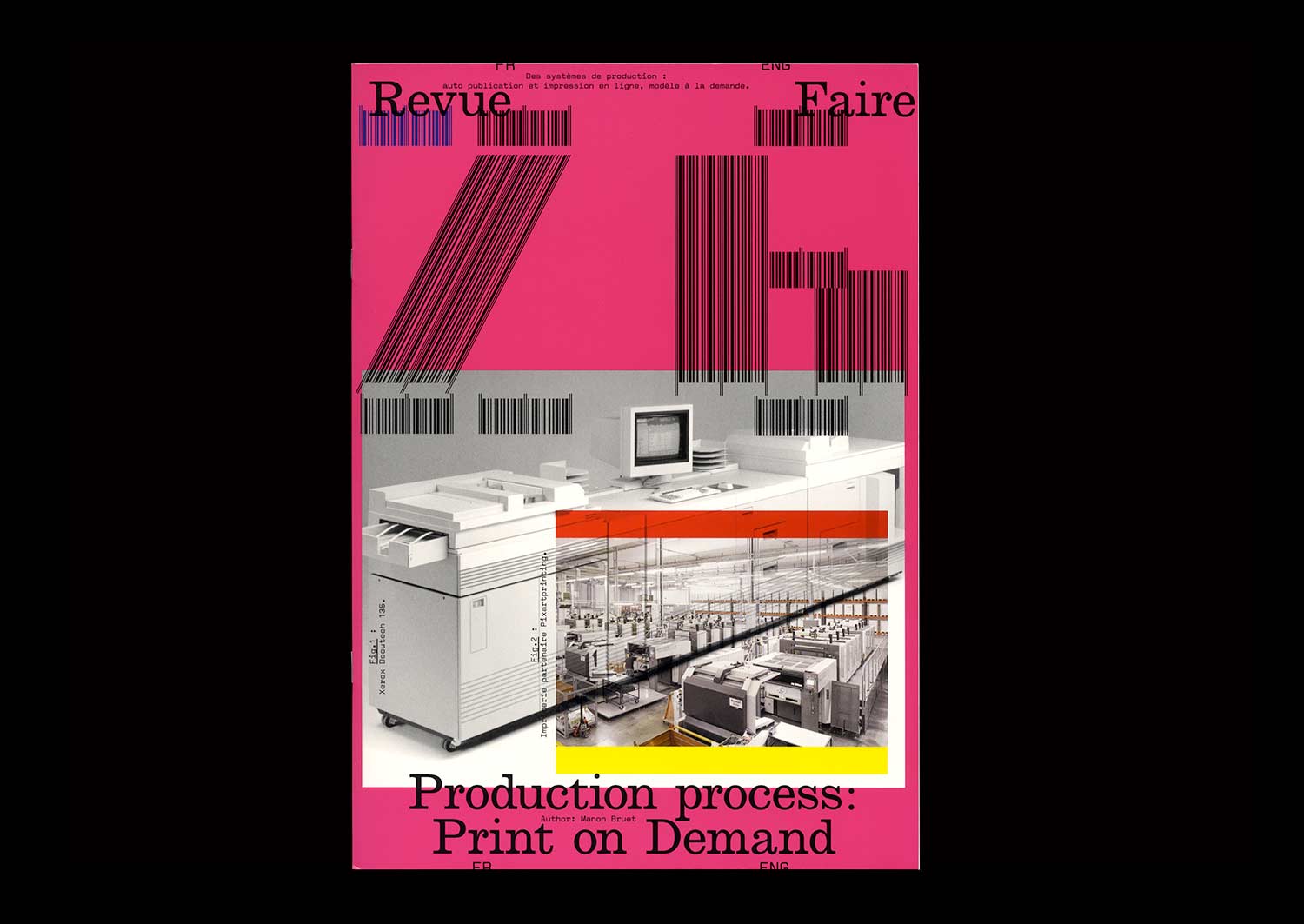
n°26 — Production process: Print on Demand. Author: Manon Bruet
Author: Manon Bruet
20 pages, 21 × 29,7 cm, CMYK
4th November 2020
ISBN: 979-10-95991-17-5
ISSN: 2558-2062
Author: Manon Bruet
20 pages, 21 × 29,7 cm, CMYK
4th November 2020
ISBN: 979-10-95991-17-5
ISSN: 2558-2062
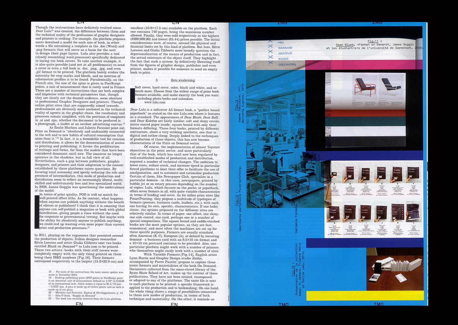
In 2008, English Graphic Designer James Goggin ran a two-day workshop with design students at the Hochschule Darmstadt in Germany. The object which resulted gradually took on the appearance of a photo album, a typeface specimen, and a color chart. On the cover, the phrase “Dear Lulu, Please try and print these line, color, pattern, format, texture and typography tests for us” is clearly addressed to the online print platform for which this book was proposed as a test.
Ten years later, the offer has become more diverse and the success of such online platforms is undeniable—indeed the phenomenon has spread well beyond the field of publishing. While some bemoan unfair competition for printers, others, professionals and amateurs, see in it a freedom to print and distribute relatively well finished objects at low cost.
The possibilities of these systems of production, are multiple but nonetheless limited, and this obviously raises the question of a possible standardization of forms and formats. However, when it comes to Print On Demand, it seems that the issue is not so much the materiality of an object (the choice of format, paper or a particular manufacture) but rather the actual existence of this object itself, outside of usual channels of production and distribution.
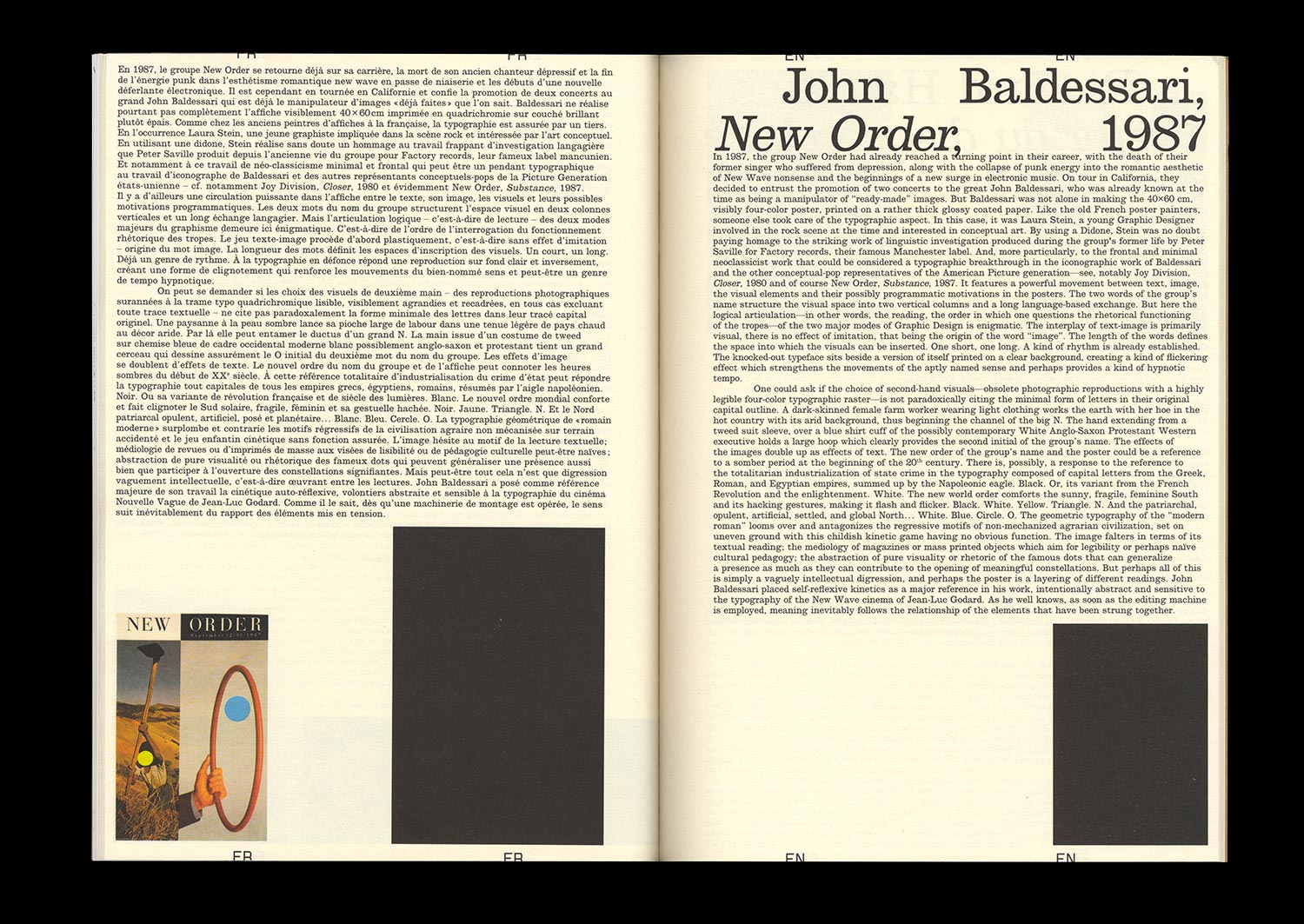
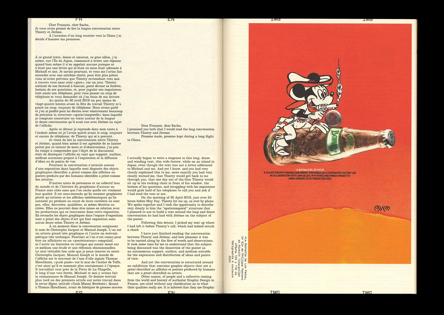
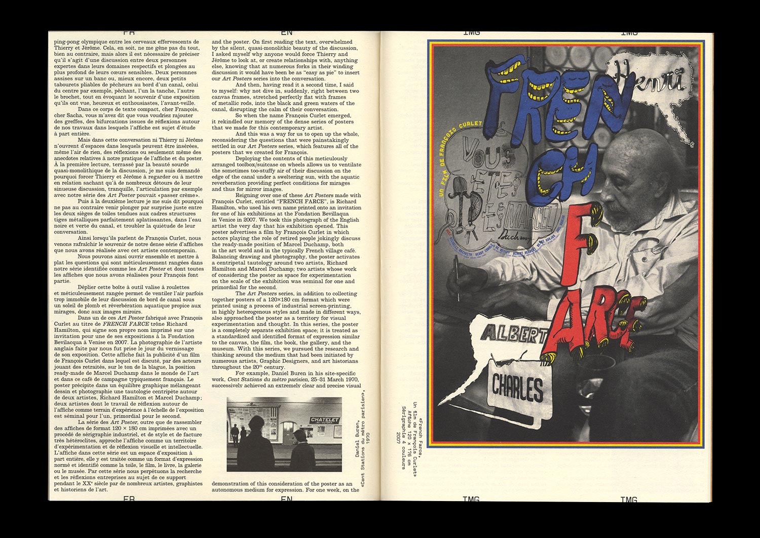
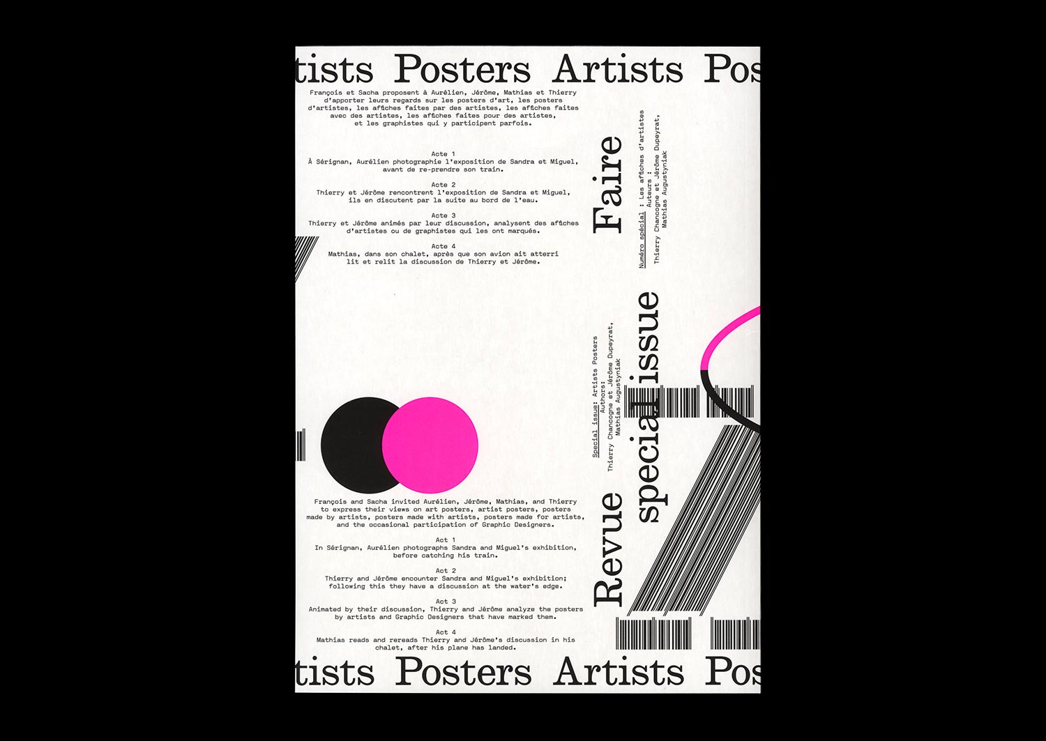
n°22 — Special Issue: Artists posters. Authors: Thierry Chancogne, Jérôme Dupeyrat, Mathias Augustyniak
Authors: Thierry Chancogne, Jérôme Dupeyrat, Mathias Augustyniak
72 pages, 21 × 29,7 cm
CMYK + 1 PMS
27 May 2020
ISBN: 979-10-95991-21-2
Authors: Thierry Chancogne, Jérôme Dupeyrat, Mathias Augustyniak
72 pages, 21 × 29,7 cm
CMYK + 1 PMS
27 May 2020
ISBN: 979-10-95991-21-2
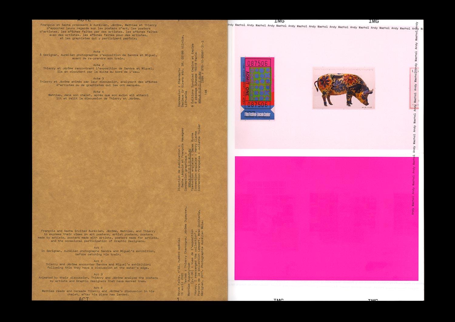
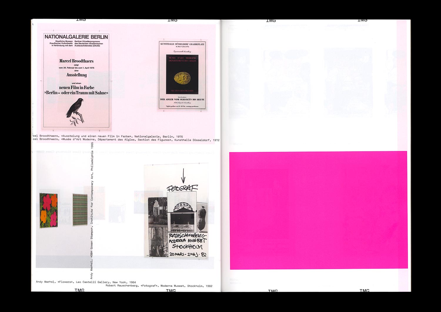
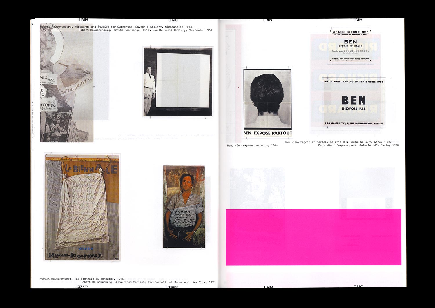
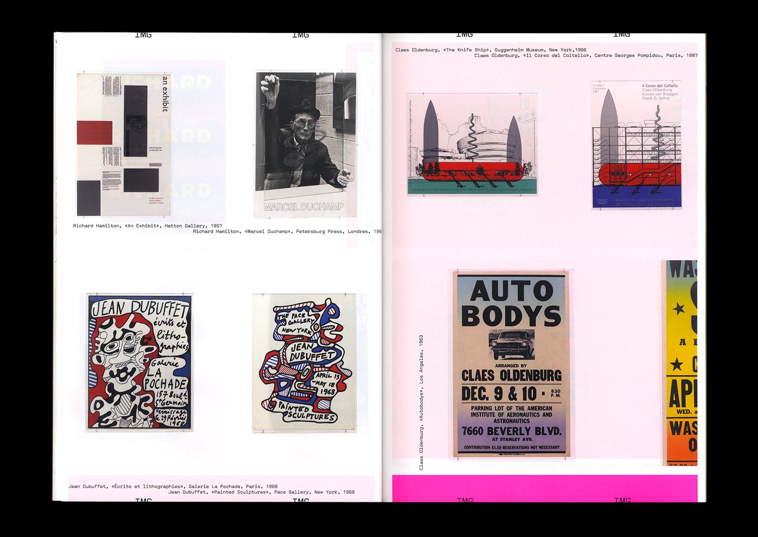
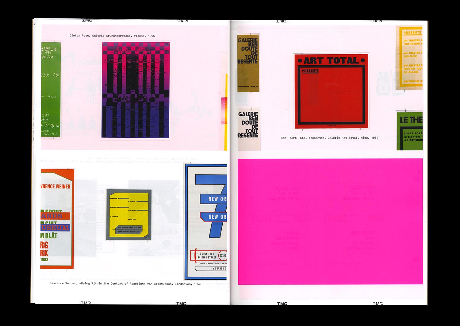
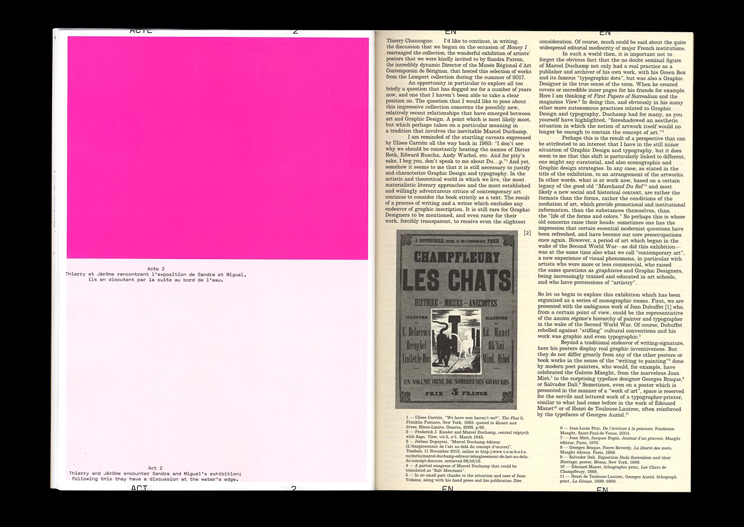
On the occasion of a visit to the exhibition at the MRAC Occitanie / Pyrénées-Méditerranée entitled Honey I rearranged the collection, Jérôme Dupeyrat and Thierry Chancogne continue their discussion of the controversial relationships that exist between art and Graphic Design, based on a historical collection of “artists’ posters”.
The artist’s poster or affiche is at once the traditional medium used to advertise artistic events, produced by the artists themselves, the historical medium of a certain passion for French-style painted posters and the desire of a particular artistic practice to democratize art, the symptom or symbol of potential new relationships between Graphic Design and art in an era where artists have acquired a new graphic culture and Graphic Designers a new artistic ambition.
The thematic exchanges nourished by theoretical, artistic, and graphic references taken from recent and contemporary history are punctuated by thoughts from Mathias Augustinyak, based on his experiences with designing posters for artists, artist posters, artistic posters, and the art of the poster.
Special 72 pages format!
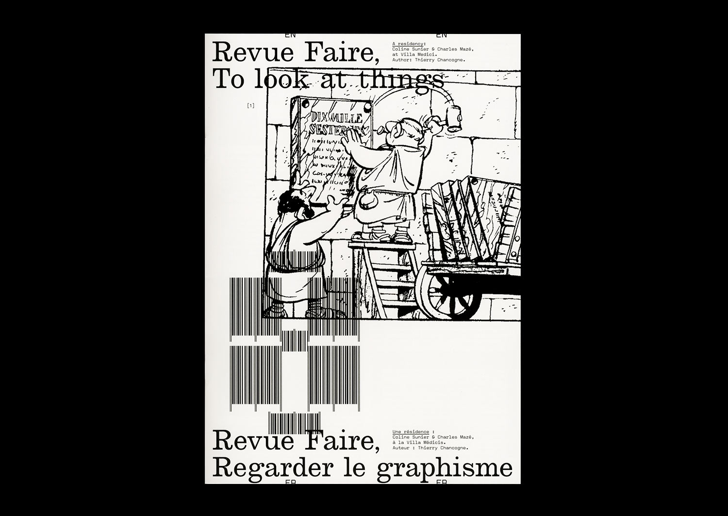
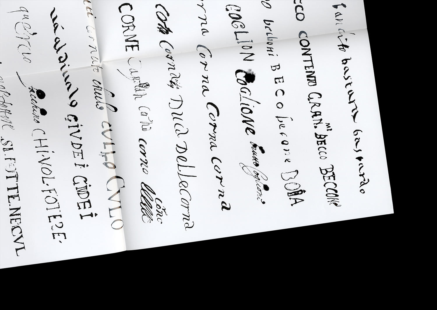
n°08 — A residency: Coline Sunier & Charles Mazé at Villa Medici. Author: Thierry Chancogne
Interview with Coline Sunier & Charles Mazé by Thierry Chancogne
20 pages, 21 × 29,7 cm,
07 February 2018
ISBN : 979-10-95991-05-2
ISSN : 2558-2096
Interview with Coline Sunier & Charles Mazé by Thierry Chancogne
20 pages, 21 × 29,7 cm,
07 February 2018
ISBN : 979-10-95991-05-2
ISSN : 2558-2096
Typo-topographic records
While still a student in the Ésad Valence, Coline Sunier, along with Grégory Ambos, created a striking front cover for the booklet associated with the Zak Kyes programme, Forms of Inquiry, using a series of jewels sampled from the more or less heraldic graphic patrimony of highly local emblems.
When she founded her studio with Charles Mazé, the duo continued the work of collection, which is at the same time one of the etymologies of reading, and one of the characteristics of the conceptual aesthetic of the list that emerged in the 1970s—first, in the re-casting of the Ésad Valence’s identity in 2012-2013; then in the work created during a residency at the Villa Médicis, Come vanno le cose?, dedicated to records of 1,512 graffiti found on the walls of Rome illustrating the portrait of a mysterious survivor, perhaps imagined, of the Red Brigades; and more recently in the identity developed for the Centre d’art contemporain in Brittany.
The collection of signs of power and the traces of resistance profoundly inscribed in the always political matter of the spaces is often accompanied by an attempt at typographic translation bringing to mind the work of typification in the personal writings of Fernand Baudin, created for the catalogue of the eponymous prize in 2012.