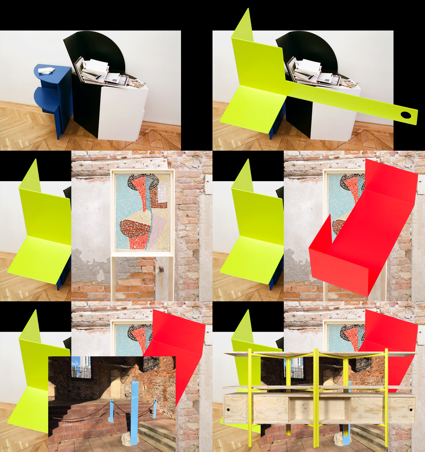
n°41 — Manuel Raeder. Author: Kiki Mazzucchelli

n°41 — Manuel Raeder. Author: Kiki Mazzucchelli
n°23 — Jan Tschichold: The Master approving of his own work. Author: Žiga Testen
Author: Žiga Testen
24 pages, 21 × 29,7 cm, CMYK
9 September 2020
ISBN: 979-10-95991-17-5
ISSN: 2558-2062
Author: Žiga Testen
24 pages, 21 × 29,7 cm, CMYK
9 September 2020
ISBN: 979-10-95991-17-5
ISSN: 2558-2062
Design history as an independent discipline and field of study appears to be in trouble. Design historians complain about its diminishing influence within universities due to the ongoing instrumentalisation of higher education. The Eurocentric canon built upon values and methods adopted from art and architecture history has been contested by decolonial theories. And finally, it appears that the trust in the institution of ‘history’ itself and its meta-narratives has eroded.
A discipline that was once considered to provide reflection on what came before and guidance on what could come to be—under the auspice of a grand narrative of continuous progress—has been replaced by modest narratives, social anthropologies, and claims of the ‘end of history’.
In this article, I rummage through the ruins of design history and try to unpack what it was that we once considered design history and our design history canon, how we wrote about it and to what end. In particular, I focus on this one image: a portrait photograph of a well-known historical figure, the designer and typographer Jan Tschichold. How is it used? And what stories do we tell about it?
n°05 — An Instagram post: P/Pa/Para/Paradiso by jetset_experimental (July 1 2017). Author: Manon Bruet
Author: Manon Bruet.
20 pages, 21 × 29,7 cm, CMYK
20 December 2017
ISBN : 979-10-95991-05-2
ISSN : 2558-2062
Author: Manon Bruet.
20 pages, 21 × 29,7 cm, CMYK
20 December 2017
ISBN : 979-10-95991-05-2
ISSN : 2558-2062
On July 1st, 2017, just as I was about to begin research into the use of social networks by Graphic Designers, the Dutch studio Experimental Jetset posted a slideshow containing 7 images on Instagram. Entitled “P/Pa/Para/Paradiso” it presented, as a whole and in its details, their new posters for the Paradiso center for music and culture in Amsterdam. Apart from the obvious formal relationship with the Blow Up poster that they created in 2007 for the London Design Museum, this slideshow gives very few keys to read what seemed to be a new aspect of the center’s communication, something that Experimental Jetset had been working on since 1996.
Currently having over 1,500 likes and tens of comments, this post is where my article begins. An opportunity to investigate and review this collaboration, that over 20 years has taken various forms (flyers, programs, posters), along with the singular and radical practice of Experimental Jetset. And also the opportunity to provide a more theoretical view of the way that Graphic Design is shown and seen on different platforms, that have now become an integral part of the teaching and the evolution of the discipline.
n°03 — A monograph: Recollected Work by Mevis & van Deursen. Author: Étienne Hervy
Author: Étienne Hervy.
20 pages, 21 × 29,7 cm, CMYK
22th November 2017
ISBN: 979-10-95991-04-5
ISSN: 2558-2062
Author: Étienne Hervy.
20 pages, 21 × 29,7 cm, CMYK
22th November 2017
ISBN: 979-10-95991-04-5
ISSN: 2558-2062
In 2006, the publisher Artimo entrusted Linda van Deursen and Armand Mevis with the editorial direction and the Graphic Design of their own monograph, Recollected Works. Joined by Paul Elliman in writing the texts, the two Graphic Designers responded with an approach similar to that which they adopt when they accompany other artists and photographers in the creation of books whose relevance has largely contributed to the studio’s reputation. Mevis and van Deursen propose to the reader to experience their work in operation, rather than simply contenting themselves with the reproduction of the work presented as artworks in themselves. Rather than the nostalgia for a more or less formalized organization of their previous projects, the two Graphic Designers look at their previous work as the material for an autonomous project from which this book will emerge.
Such a choice directly raises the question of the constitution and transmission of a culture inherent to Graphic Design, whether it isspecifically aimed at designers or else at a much wider audience. How to transmit the issues and points of quality of a discipline itself dedicated to transmission? One must above all recognize the capacity of this eminently visual field to confront appearances.
Our study of this work will obviously reference a corpus of monographs and publications made by Graphic Designers (Christophe Jacquet, Joost Grootens, M/M (Paris), Karel Martens, Experimental Jetset, Wolgang Weingart, etc.) while at the same time looking more widely at the forms currently adopted for the transmission of Graphic Design (exhibitions, conferences, etc.). Beyond the issues discussed and the questions raised by Recollected Works, it is a matter of both pulling on the thread of the work of Mevis and van Deursen (does a continuity exist between the editorial design of Why Mister, Why? for Geert van Kesteren or the Library Of The Museum Museum of Contemporary African Art for Meschac Gaba, and the identity of the Stedelijk Museum?) and questioning the pertinence of a discourse specific to Graphic Design.
