n°41 — Manuel Raeder. Author: Kiki Mazzucchelli
n°41 — Manuel Raeder. Author: Kiki Mazzucchelli
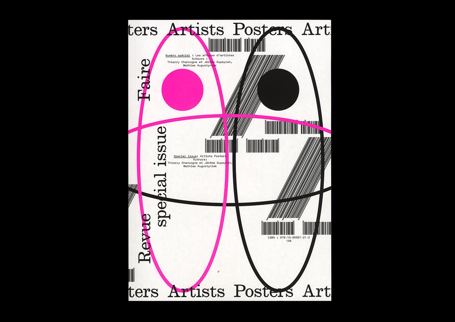
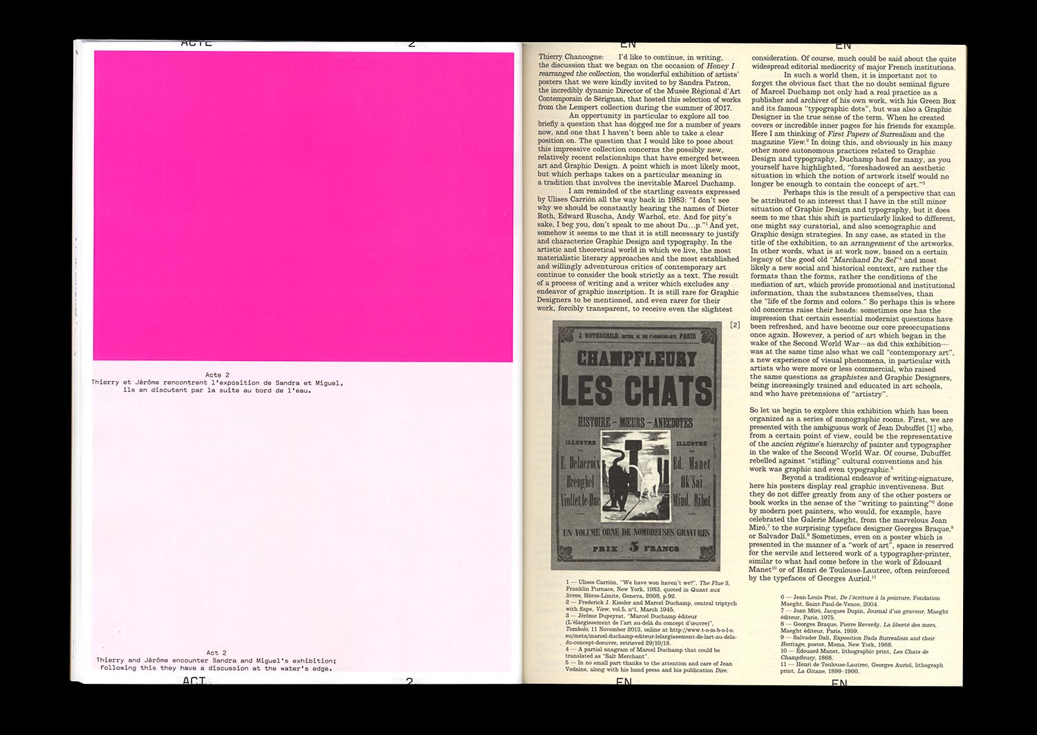
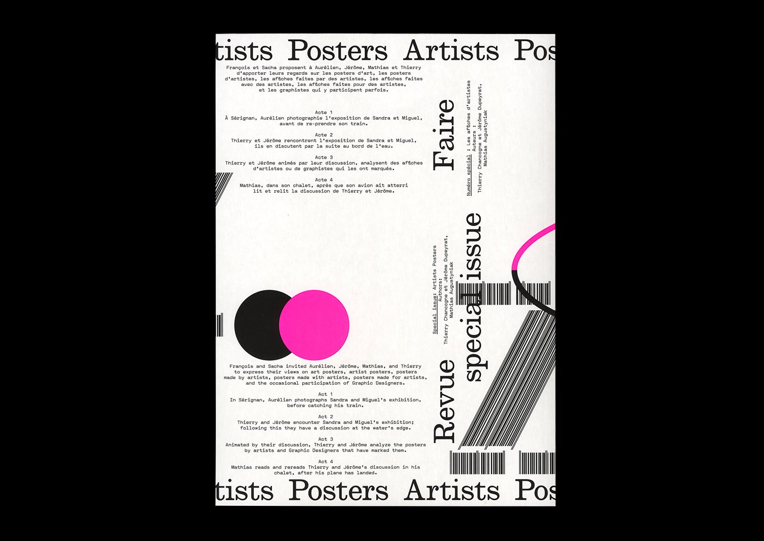
n°22 — Special Issue: Artists posters. Authors: Thierry Chancogne, Jérôme Dupeyrat, Mathias Augustyniak
Authors: Thierry Chancogne, Jérôme Dupeyrat, Mathias Augustyniak
72 pages, 21 × 29,7 cm
CMYK + 1 PMS
27 May 2020
ISBN: 979-10-95991-21-2
Authors: Thierry Chancogne, Jérôme Dupeyrat, Mathias Augustyniak
72 pages, 21 × 29,7 cm
CMYK + 1 PMS
27 May 2020
ISBN: 979-10-95991-21-2
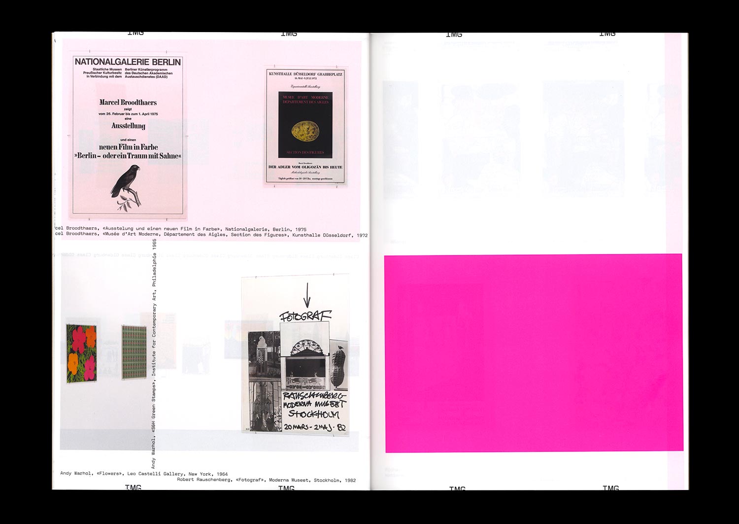
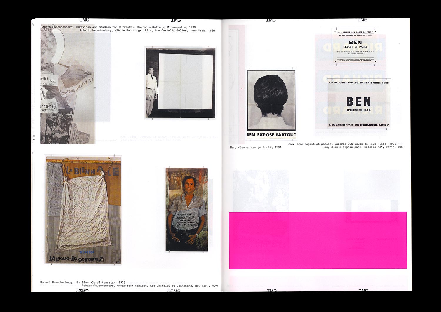
On the occasion of a visit to the exhibition at the MRAC Occitanie / Pyrénées-Méditerranée entitled Honey I rearranged the collection, Jérôme Dupeyrat and Thierry Chancogne continue their discussion of the controversial relationships that exist between art and Graphic Design, based on a historical collection of “artists’ posters”.
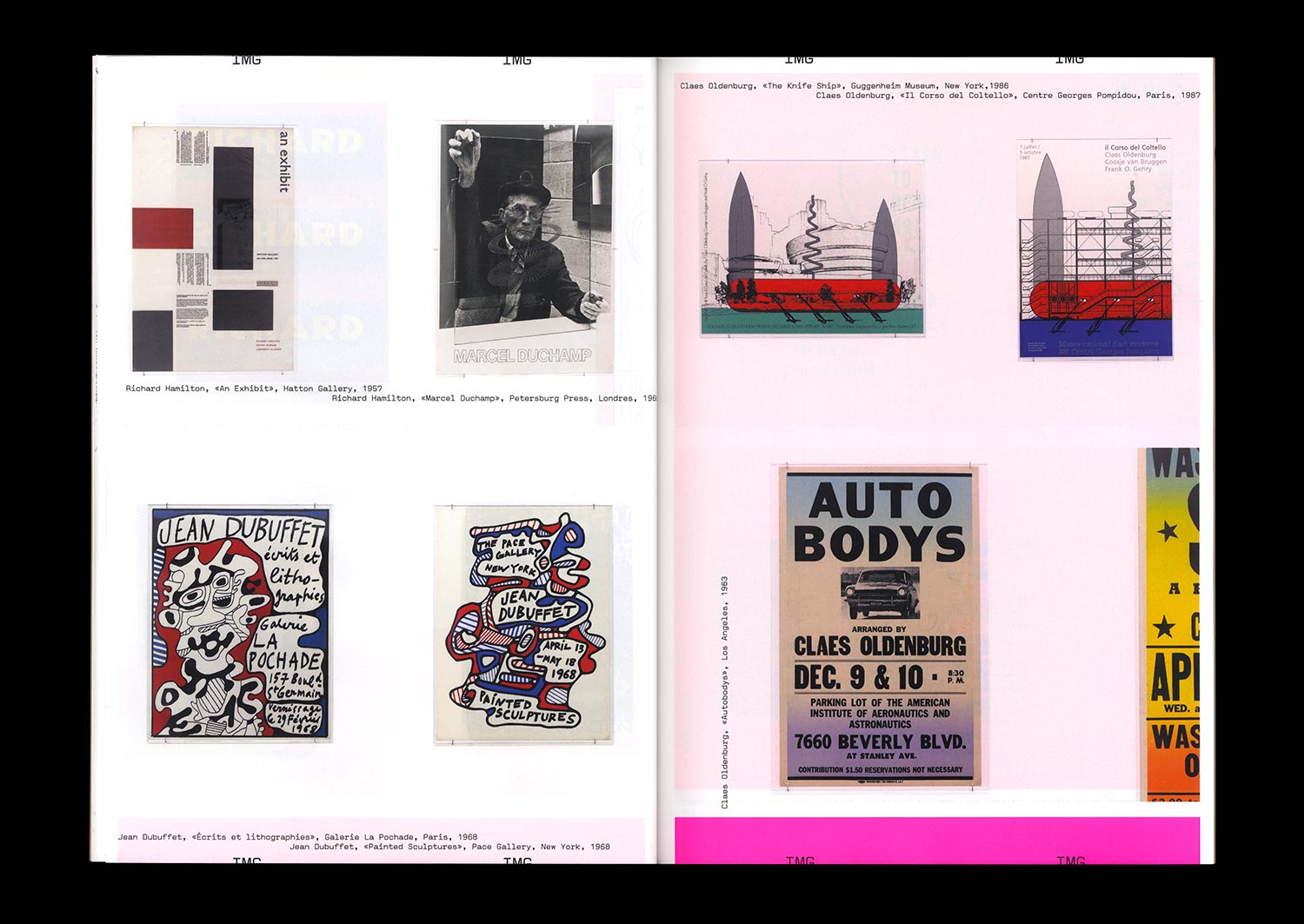
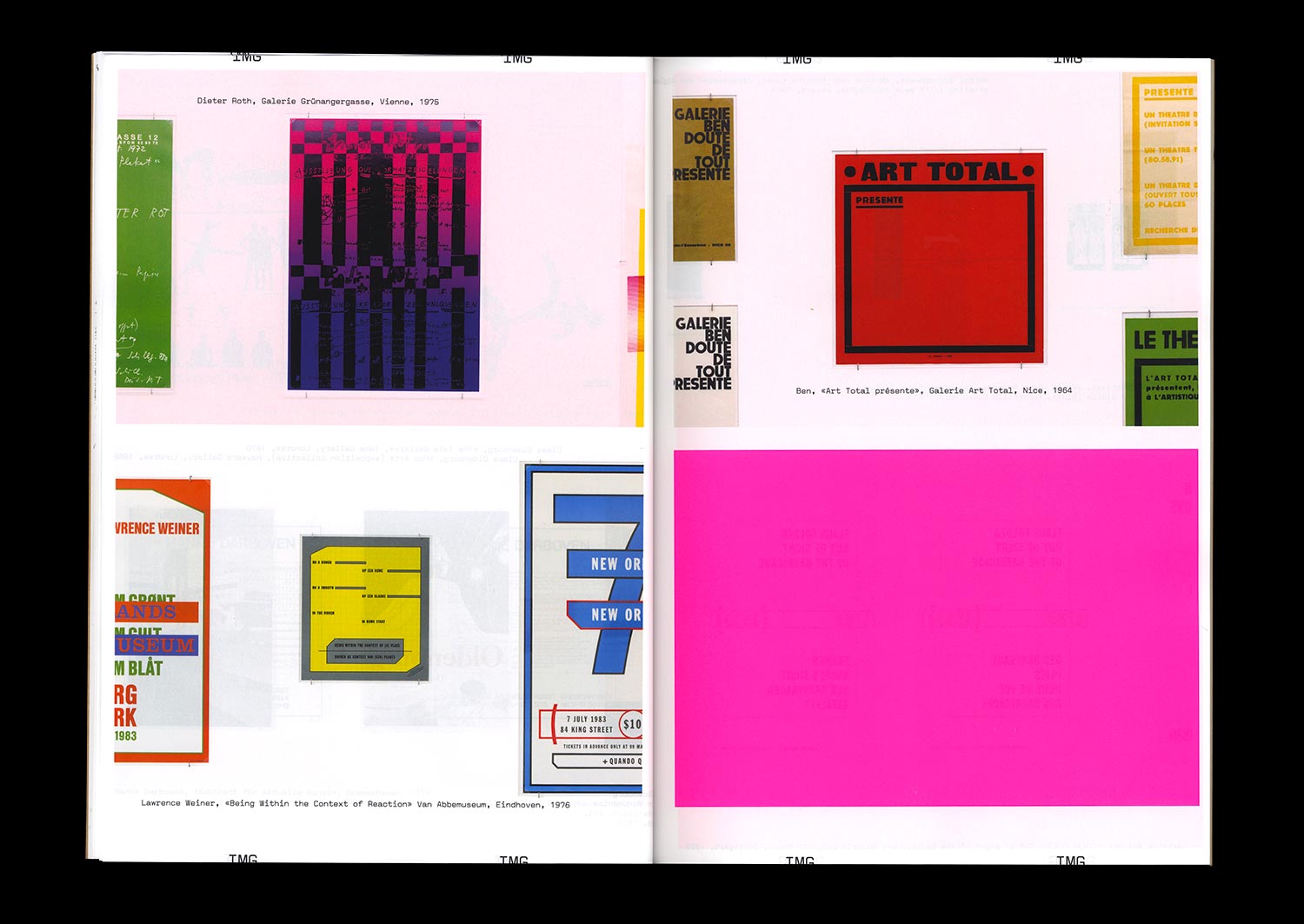
The artist’s poster or affiche is at once the traditional medium used to advertise artistic events, produced by the artists themselves, the historical medium of a certain passion for French-style painted posters and the desire of a particular artistic practice to democratize art, the symptom or symbol of potential new relationships between Graphic Design and art in an era where artists have acquired a new graphic culture and Graphic Designers a new artistic ambition.
The thematic exchanges nourished by theoretical, artistic, and graphic references taken from recent and contemporary history are punctuated by thoughts from Mathias Augustinyak, based on his experiences with designing posters for artists, artist posters, artistic posters, and the art of the poster.
Special 72 pages format!
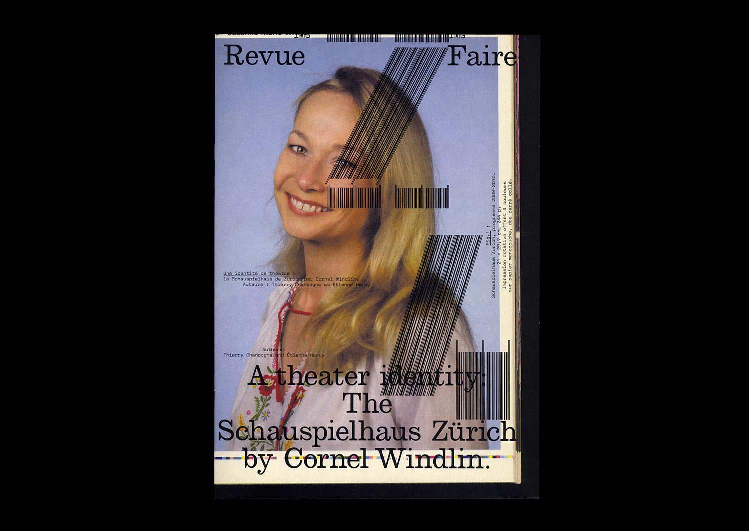
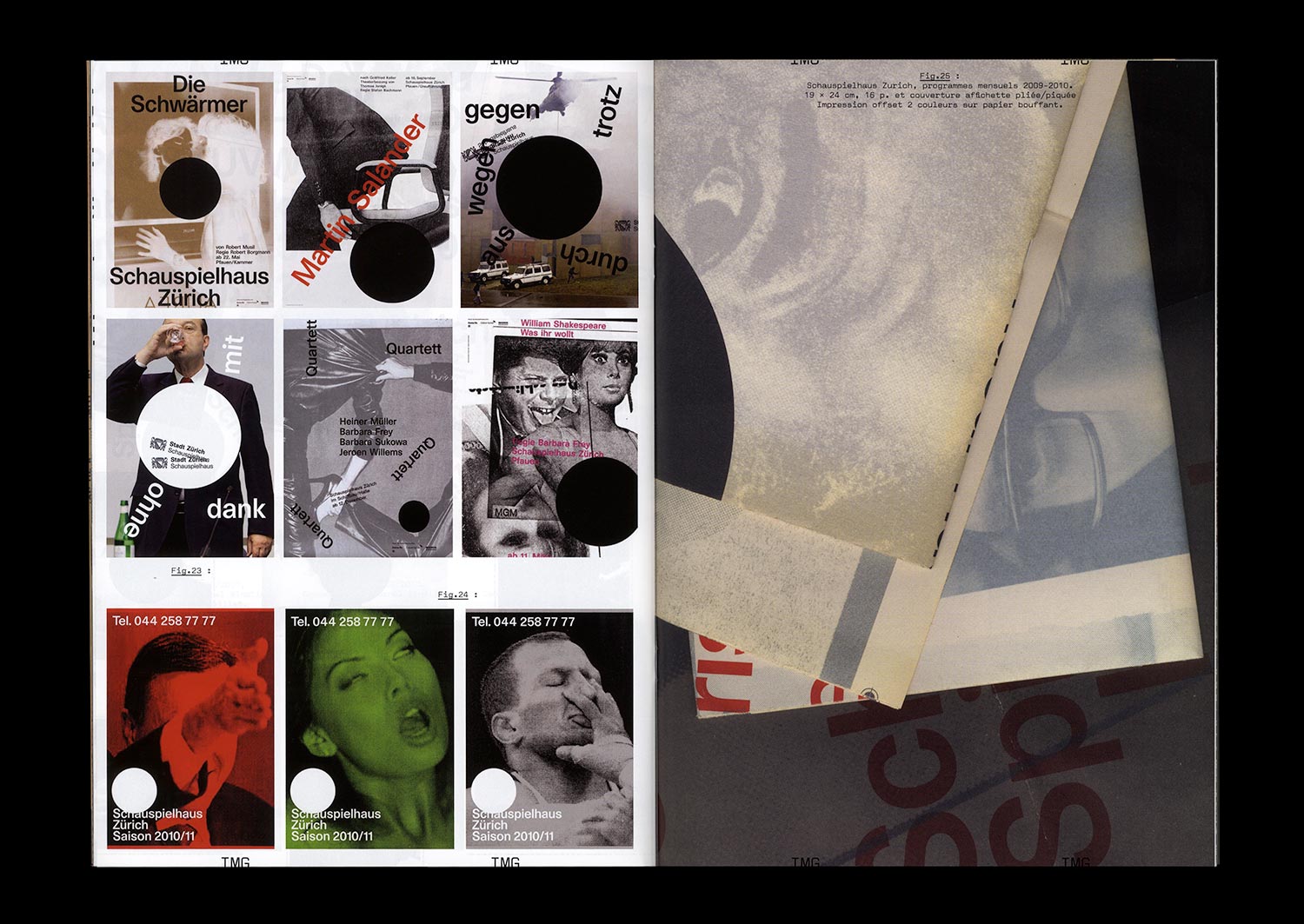
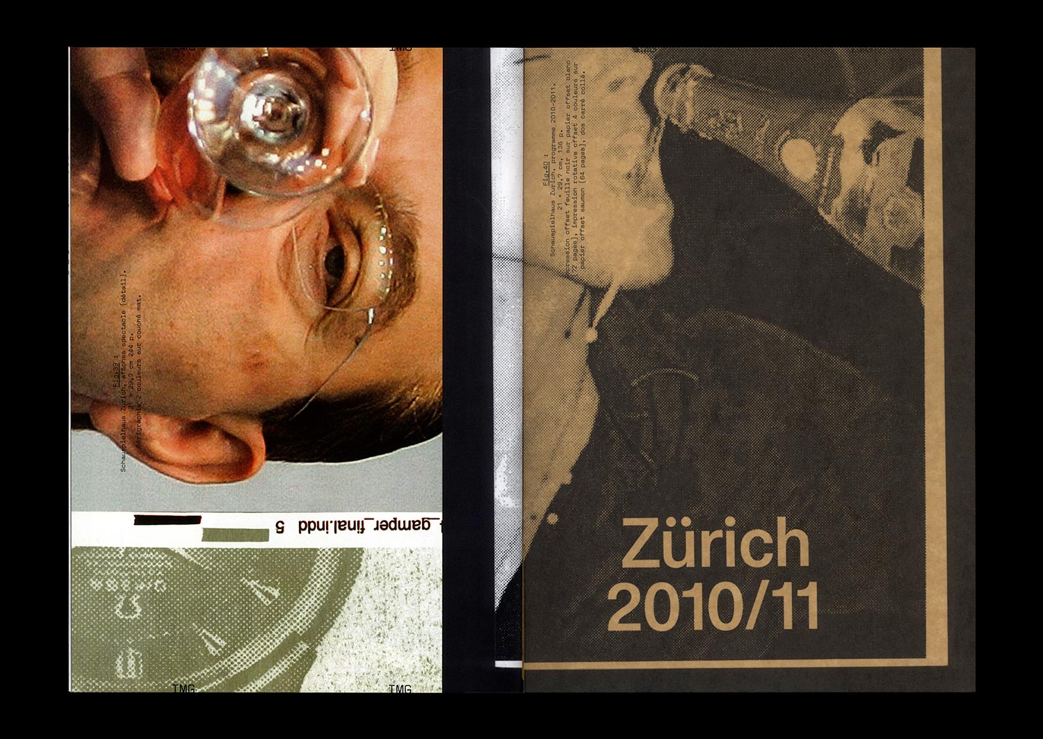
n°24 — A theater identity: The Schauspielhaus Zürich by Cornel Windlin. Authors: Étienne Hervy and Thierry Chancogne
Authors: Étienne Hervy and Thierry Chancogne
36 pages, 21 × 29,7 cm, CMYK
23th September 2020
ISBN: 979-10-95991-17-5
ISSN: 2558-2062
Authors: Étienne Hervy and Thierry Chancogne
36 pages, 21 × 29,7 cm, CMYK
23th September 2020
ISBN: 979-10-95991-17-5
ISSN: 2558-2062
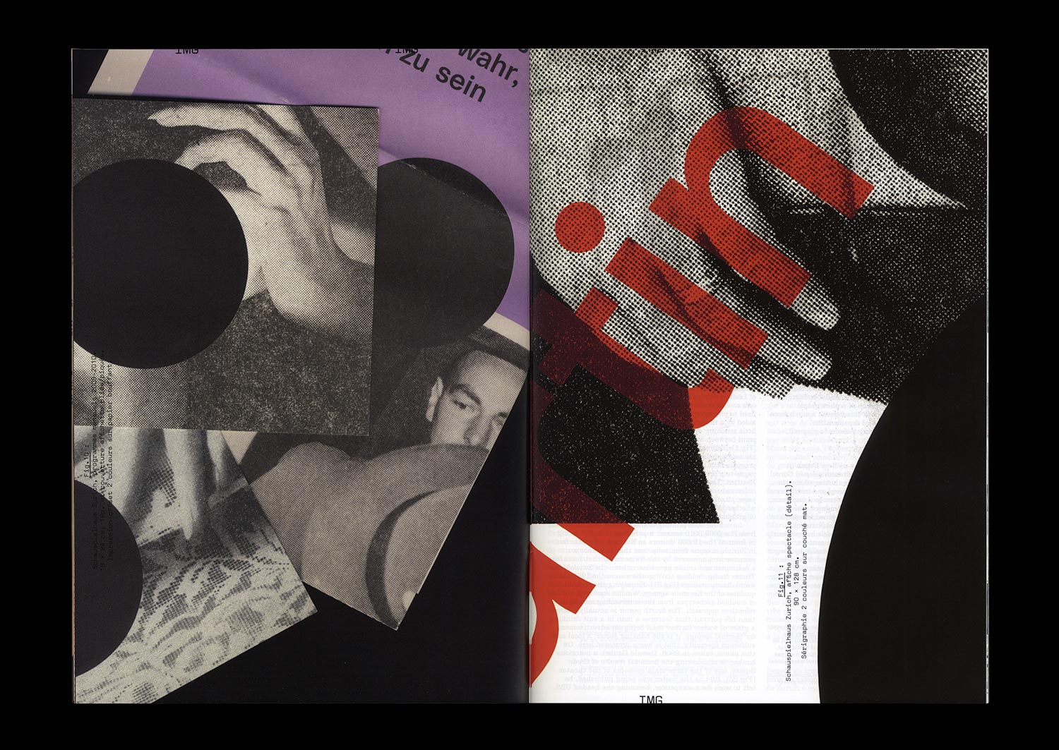
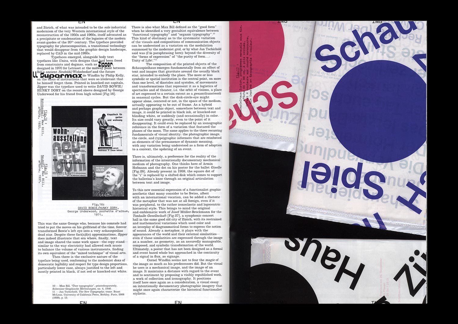
Designed by Cornel Windlin (with Gregor Huber), the communications of the Zürich Schauspielhaus for the 2009/10 and 2010/11 seasons appeared just as the collaboration between the designers and the theater ended: with the Grand Prix of the Brno Biennial in 2010, where they won first prize in the international competition, with an exhibition in Chaumont the following year at the same time as the Swiss Federal Design Award, a brief appearance in specialist magazines and on specialist sites, and then nothing at all. Once again, Cornel Windlin retreated into the shadows, leaving behind work which asserted itself through both its amplitude and completeness in the heavy silence which remained, and through the multifaceted mass of the media imagery that it reactivated. A series of seasonal posters, event posters, annual and monthly programs, booklets dedicated to each piece, invitations, flyers, graphic materials from the program for younger audiences… everything is here, set in a precisely tuned bold Unica77, digitized by the Lineto foundry with the original team of designers (along with Windlin), all coming together in that blindness inherent to times of eclipse, where the black disk chosen by Windlin as the identity of the Schauspielhaus stands out. Now, a decade later, the idea is to propose a meticulously organized reception, informed by Cornel Widlin and placed in a cavalier perspective by the analysis of Thierry Chancogne.
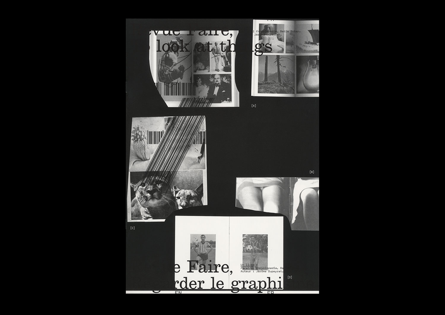
n°07 — A book: Parallel Encyclopedia, Batia Suter. Author: Jérôme Dupeyrat
Author: Jérôme Dupeyrat.
20 pages, 21 × 29,7 cm, CMYK
24 January 2018
ISBN: 979-10-95991-05-2
ISSN: 2558-2062
Author: Jérôme Dupeyrat.
20 pages, 21 × 29,7 cm, CMYK
24 January 2018
ISBN: 979-10-95991-05-2
ISSN: 2558-2062
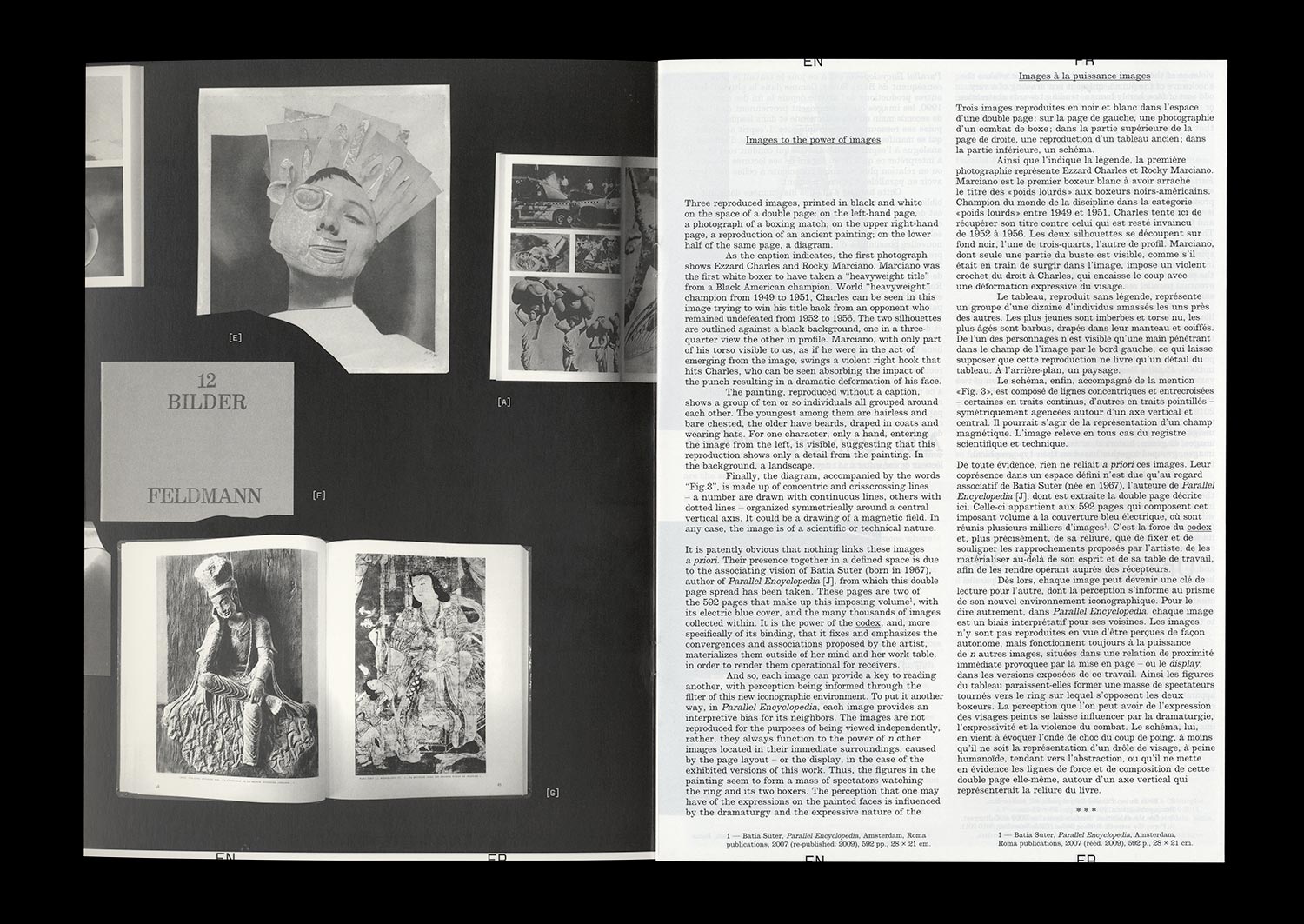
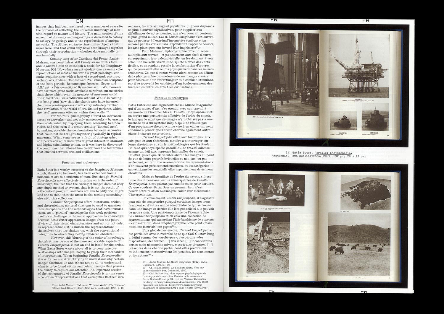
Since the end of the 1990s, Batia Suter has been collecting books—second hand for the most part—that she acquires for their iconography, in such a way as to build up an image database that sits on the shelves of her personal library. All of this has become the basic material for an artwork that consists of presenting the images according to a logic of visual editing, providing them with new modalities of appearance and thus new possibilities of interpretation.
Parallel Encyclopedia is, at the time of writing, the artist’s most significant work. Ongoing since 2004, it has taken the form of a number of installations and two imposing publications from Roma Publications published in 2007 and 2016. Each version of the project is characterized by the association of hundreds of heteroclite images (historical, artistic, scientific, and technical), grouped according to typological and formal links. From one system to another, the conditions of presentation of these images taken from books are renewed: the sequencing and seriality of bound pages; constellations or, on the contrary, linear sequences of images reproduced and exhibited on wall panels; constellations or linear sequences of book pages opened and placed on flat mounts. Though the exhibited images are the same, these various exhibition possibilities determine differential readings.
Beyond the fascination that such a project can generate, this text will attempt to seize all of its complexity. To do this, Batia Suter’s work will be re-situated within the context of a history of iconographic practices that run through different fields of activities and knowledge. We will also focus on the trajectory of the images gathered in Parallel Encyclopedia and the effects of the process of remediation to which they are subjected. Ultimately, it will be a question of drawing a figure of the artist as an “editor” and of studying both the function of Graphic Design in the artist’s work and the place that we can attribute to the artist in the field of Graphic Design, a field to which Batia Suter doesn’t directly belong, but one that runs through her productions, and to which she was confronted in a concrete fashion in the context of her collaboration with the Graphic Designer Roger Willems in the design of the two volumes of the encyclopedia that, in fact, is today a reference for many artists, as much as it is for a large number of Graphic Designers.