n°44 — Four Templates. Author: Stuart Bertolotti-Bailey

n°44 — Four Templates. Author: Stuart Bertolotti-Bailey
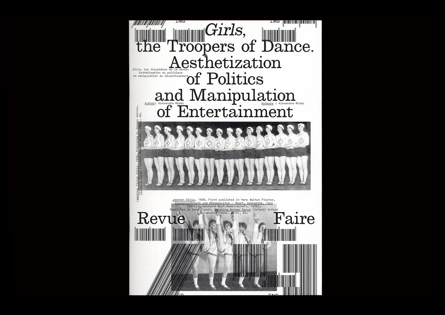
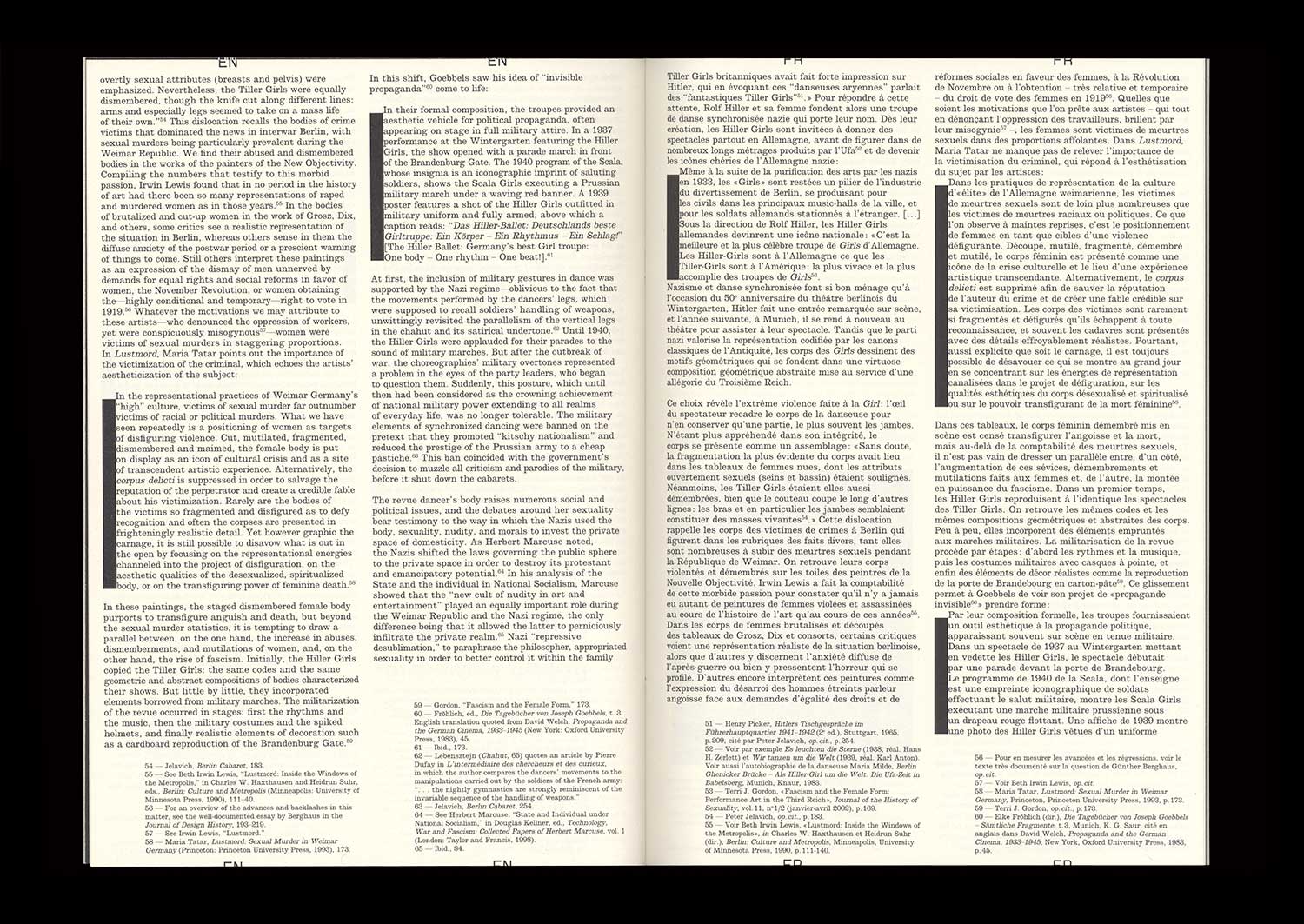
n°29 — Girls, the Troopers of Dance. Aesthetization of Politics and Manipulation of Entertainment. Author: Alexandra Midal
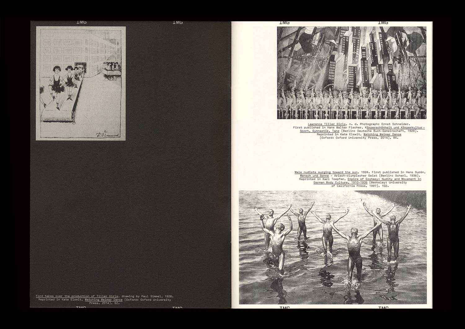
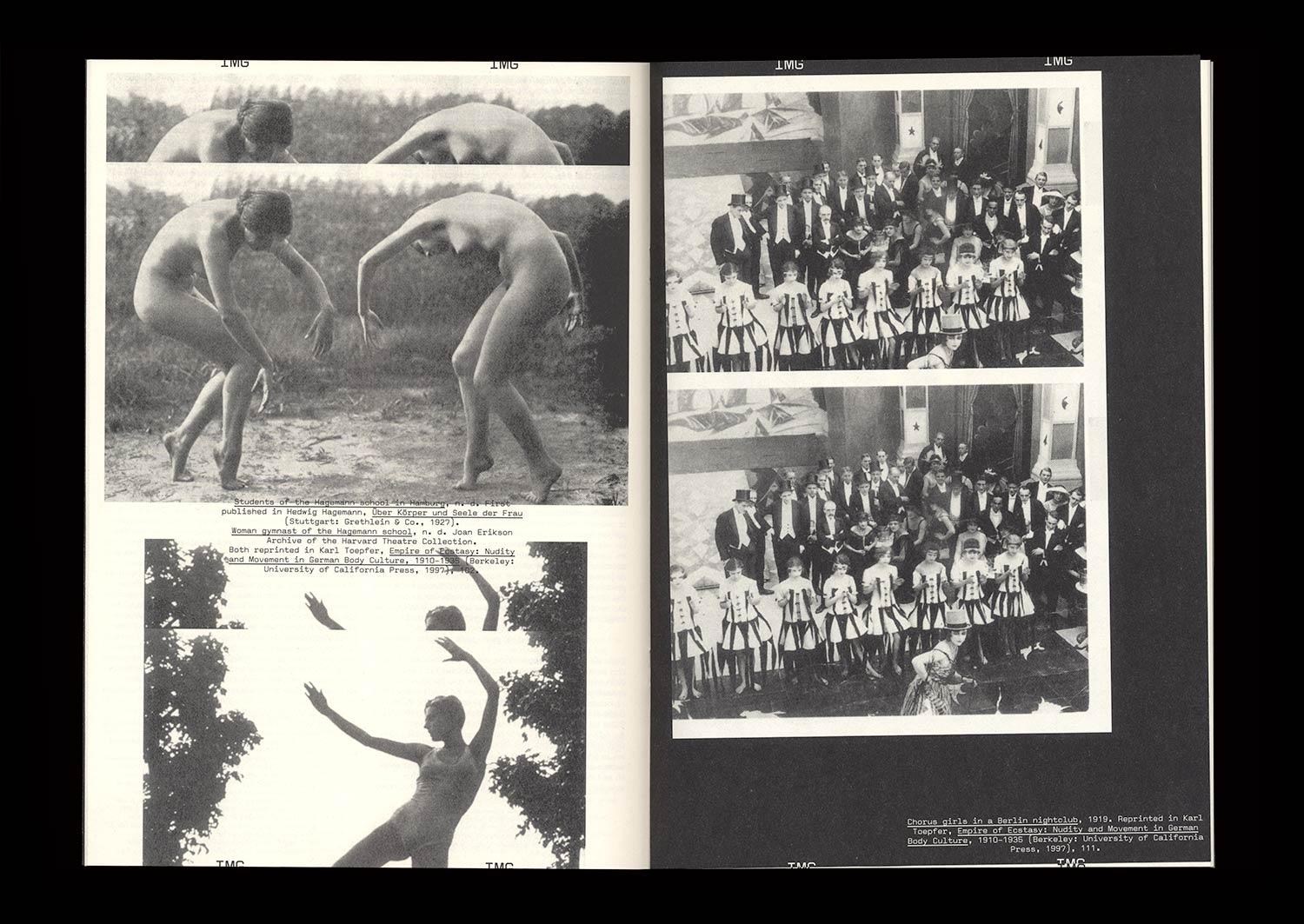
The British origins of synchronized dancing—invented in 1880 by John Tiller in a cotton mill—were quickly forgotten in Berlin, where periodicals established themselves as the expression of standardization and American capitalism. The famous Tiller Girls had become the modern figure of the “New Woman”, performing in shows attracting more than four million spectators each year. A seduced Hitler asked for his own troupe: the Hiller Girls. Face to face, both periodicals look like strictly indistinguishable replicas, apart from their opposite messages.
Synchronized dancing revealed the democratic and fascist forms given to the political discourse of the Weimar Republic when the NSDAP seized power. Between the power of forms and forms of power, amid the destruction of cities, decrees banishing the use of Fraktur, and the destruction of degenerate art, those dance shows, undoubtedly because of their popularity, showed that National Socialism was using insidious and invisible strategies to empty forms of their content only to maintain their appearance intact, thus revealing a shadow practice that, in the end, turned out to be just as barbaric as world-wide destruction or the burning of books.
n°26 — Production process: Print on Demand. Author: Manon Bruet
Author: Manon Bruet
20 pages, 21 × 29,7 cm, CMYK
4th November 2020
ISBN: 979-10-95991-17-5
ISSN: 2558-2062
Author: Manon Bruet
20 pages, 21 × 29,7 cm, CMYK
4th November 2020
ISBN: 979-10-95991-17-5
ISSN: 2558-2062
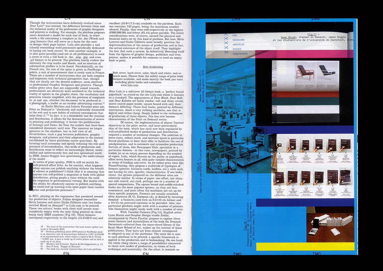
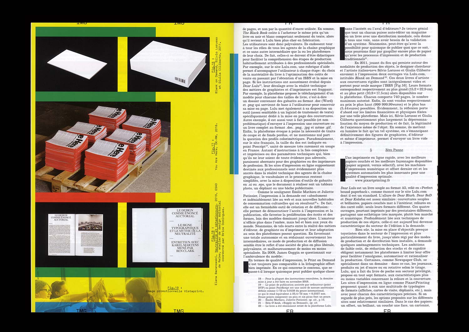
In 2008, English Graphic Designer James Goggin ran a two-day workshop with design students at the Hochschule Darmstadt in Germany. The object which resulted gradually took on the appearance of a photo album, a typeface specimen, and a color chart. On the cover, the phrase “Dear Lulu, Please try and print these line, color, pattern, format, texture and typography tests for us” is clearly addressed to the online print platform for which this book was proposed as a test.
Ten years later, the offer has become more diverse and the success of such online platforms is undeniable—indeed the phenomenon has spread well beyond the field of publishing. While some bemoan unfair competition for printers, others, professionals and amateurs, see in it a freedom to print and distribute relatively well finished objects at low cost.
The possibilities of these systems of production, are multiple but nonetheless limited, and this obviously raises the question of a possible standardization of forms and formats. However, when it comes to Print On Demand, it seems that the issue is not so much the materiality of an object (the choice of format, paper or a particular manufacture) but rather the actual existence of this object itself, outside of usual channels of production and distribution.
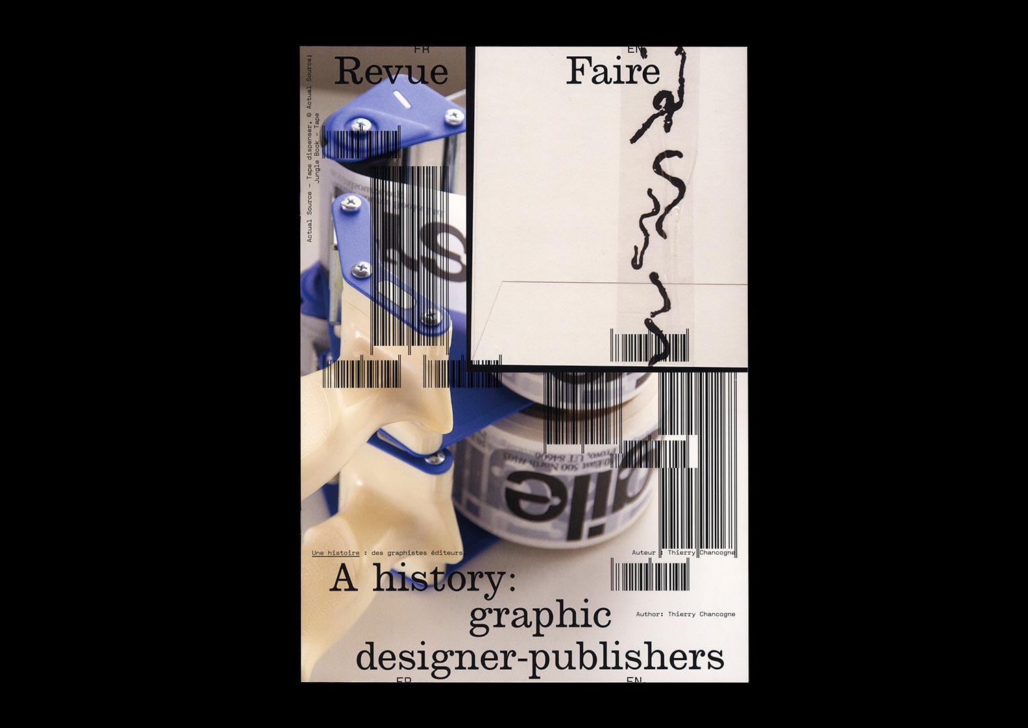
n°19 — A history: graphic designer-publishers. Author: Thierry Chancogne
Author: Thierry Chancogne
20 pages, 21 × 29,7 cm, CMYK
5th February 2020
ISBN: 979-10-95991-16-8
ISSN: 2558-2062
Author: Thierry Chancogne
20 pages, 21 × 29,7 cm, CMYK
5th February 2020
ISBN: 979-10-95991-16-8
ISSN: 2558-2062
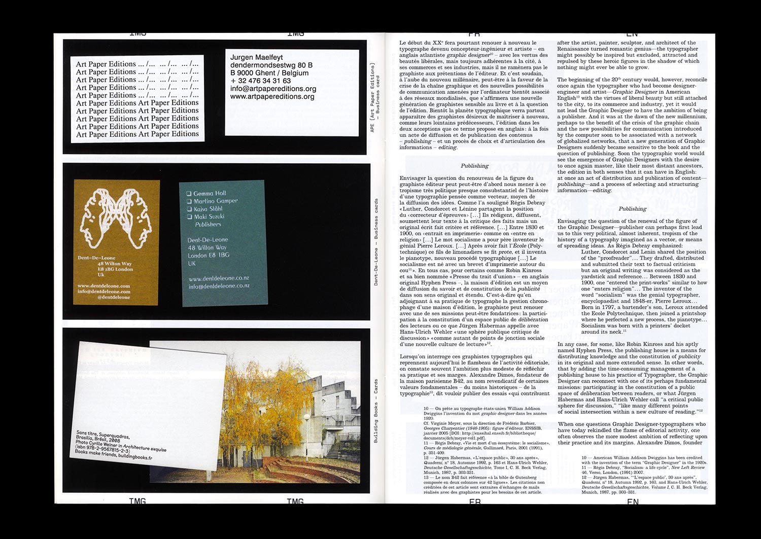
In 1275, the kingdom of France ruled on the rights of stationarii (copyists) and librarii (librairies, the French for “bookshop”), newly emancipated from the yoke of the Church (Friedrich Karl von Savigny (author and publisher), Histoire du droit romain au moyen âge, Tome III, Charles Hingray, Paris, 1839 (1815), p. 415). The main question was and has always been, even before the invention of printing, the regulation of the circulation of writing, and the designation of those responsible for their inscription and distribution.
Robin Kinross identified the emergence of the modern figure of the typographer in the 17th century, with The doctrine of handy-works: applied to the art of printing by Joseph Moxon (Robin Kinross, Modern typography: An Essay in Critical History, Hyphen Press, London, 2004 (1992) pp. 15-16). But long before this, graphic artists, copyists, and typographers such as Geoffroy Tory and Henri Estienne the elder were both booksellers and publishers who gave much thought to their practice and the contents that they released into the public space.
It would seem that the time has come to reassess this ancient tradition, with more and more graphic artists and designers choosing to establish their own publishing houses in order to defend their editorial approach in both senses of the word—that of “editing” and the choice and organization of graphic material, but also in the sense of “publishing”, applying a certain ethic to the distribution and advertising of the contents.