n°45 — Hans Rudolf Lutz: To Lutz at things. Authors: Olivier Lebrun, Urs Lehni and Tania Prill
n°45 — Hans Rudolf Lutz: To Lutz at things. Authors: Olivier Lebrun, Urs Lehni and Tania Prill
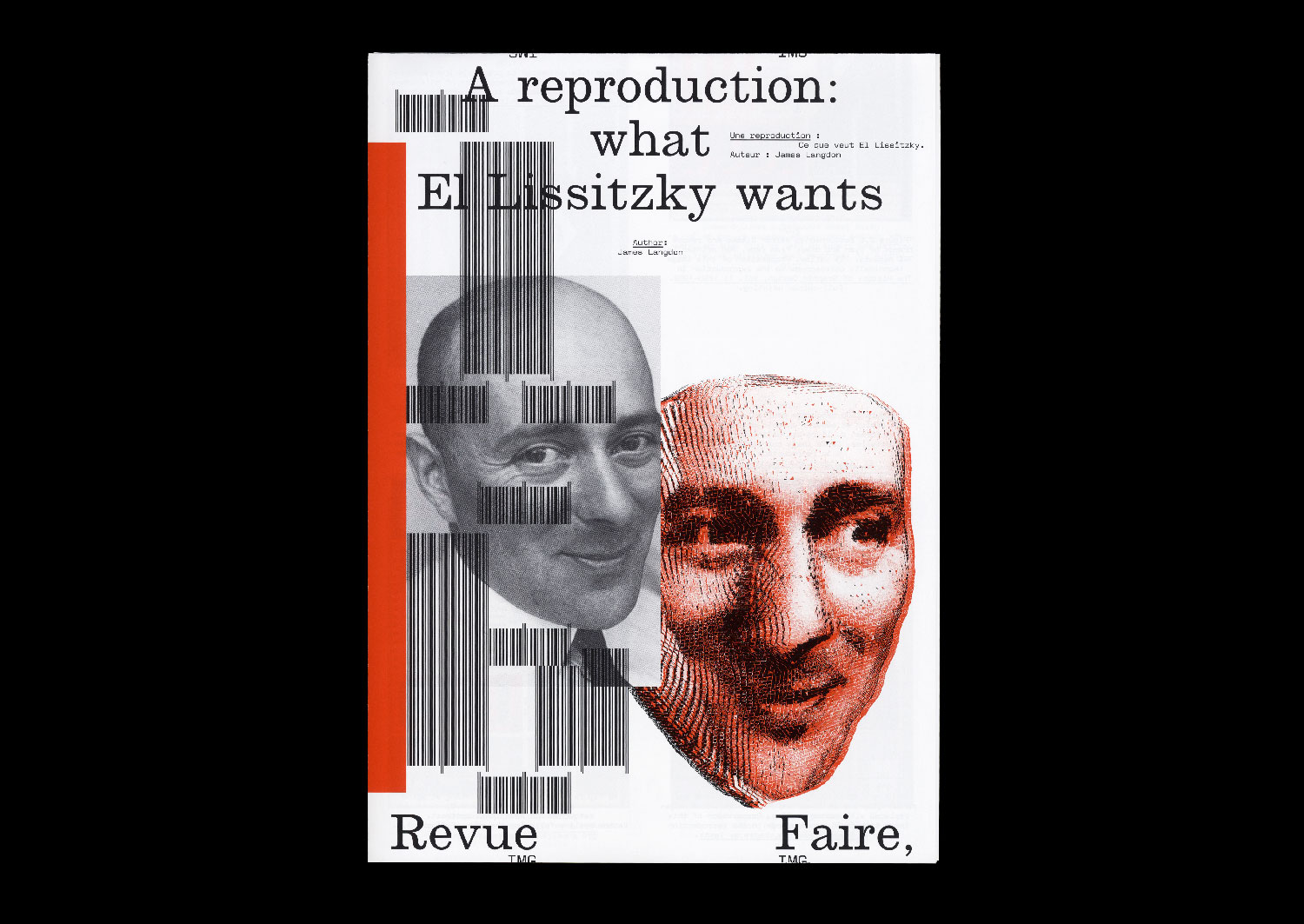
16 — A reproduction: what El Lissitzkzy wants. Author: James Langdon
Author: James Langdon
20 pages, 21 × 29,7 cm, CMYK+1PMS
7th November 2019
ISBN: 979-10-95991-15-1
ISSN: 2558-2062
Author: James Langdon
20 pages, 21 × 29,7 cm, CMYK+1PMS
7th November 2019
ISBN: 979-10-95991-15-1
ISSN: 2558-2062
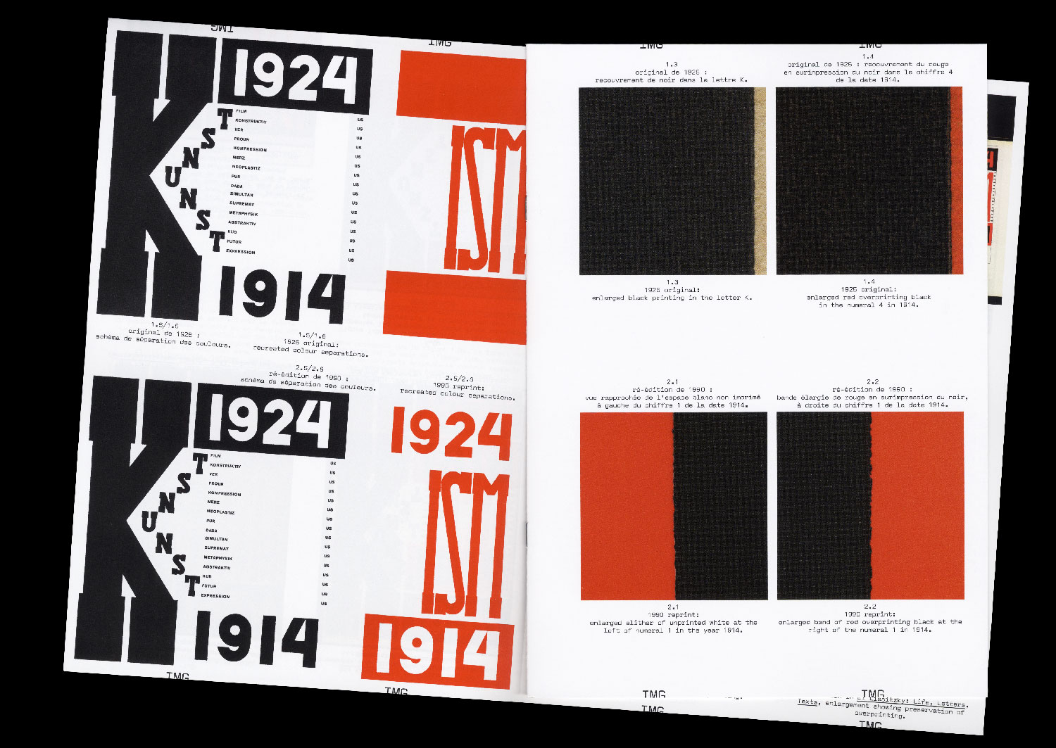
I am rarely convinced when I see graphic design that was originally printed in two inks reproduced in four- colour process. Before the advent of commercial colour offset printing, the elementary colours of printing — from Gutenberg to Tschichold — were black and red. In the early twentieth century, black and red were used by graphic designers not to attempt to recreate the spectrum of colours that appear to the human eye, but as graphic forces in themselves. To make a distinction. To create dynamism. To embody ideology on the page. In particular, the combination of black and red on white paper has become synonymous with Suprematism and revolutionary Russian graphic design.
A contemporary imaging workflow can enable extraordinary reproductions of these historical aesthetics. A high- resolution digital photograph of an original black and red printed book from the 1920s can be processed using a colour profile to calibrate its appearance across design, colour correction in computer software, proofing, and printing. This workflow can ultimately achieve a beautiful and precise image of that graphic artefact as it looks today, down to small details of its patination, its discoloration by exposure to sunlight, and the many more other subtleties that define it as an archival object.
But such a reproduction exhibits a strange technical anachronism. What about the constraints that originally shaped the design of that bookk — the implicit connection between the two colours of its graphics and the architecture of the one- or two-colour printing press on which it was printed? Are they not important? Can they even be reproduced?
I compare printed reproductions of the proud black and red cover of the book ‘Die Kunstismen’ (1925), designed by Russian artist and designer El Lissitzky. Published between 1967 and 2017, these images treat the material characteristics of the original book’s colour in different ways, appealing to contradictory notions of fidelity.
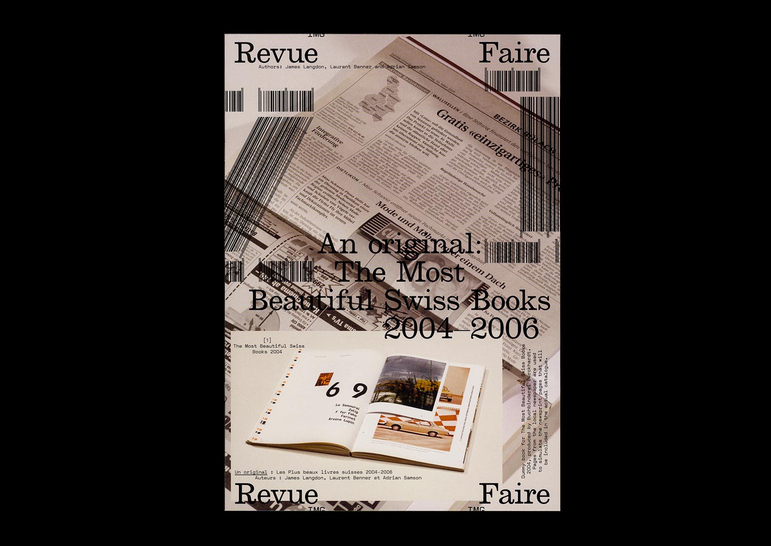
n°21 — An original: The Most Beautiful Swiss books 2004–2006. Authors: James Langdon, Laurent Benner & Adrian Samson
Interview with Laurent Benner by James Langdon
Photos: Adrian Samson
20 pages, 21 × 29,7 cm, CMYK
25th March 2020
ISBN: 979-10-95991-16-8
ISSN: 2558-2062
Interview with Laurent Benner by James Langdon
Photos: Adrian Samson
20 pages, 21 × 29,7 cm, CMYK
25th March 2020
ISBN: 979-10-95991-16-8
ISSN: 2558-2062
The awards programme The Most Beautiful Swiss Books has been organised almost without interruption by the Swiss Federal Office of Culture since 1943. A book design award with such history, particularly in a book-making culture as rich as Switzerland’s, offers insightful perspectives on Graphic Design for publishing, the culture that commissions and values it, and the critical discourse that surrounds it.
Each year the awarded books are documented in a substantial catalogue, made by one of the graphic designers awarded in previous years. The inherently self-reflexive tendencies of such catalogues—books about books, Graphic Design in the context of Graphic Design—present stimulating yet rather fraught conditions for graphic designers to work in. Looking back over the catalogues produced during the last two decades, a conversation-through-practice is clearly legible. After a conceptually sophisticated catalogue or series (often designers have been commissioned for series of two or three catalogues) follows a simple visual document. After a modest, finely-crafted production comes something more lavish or experimental.
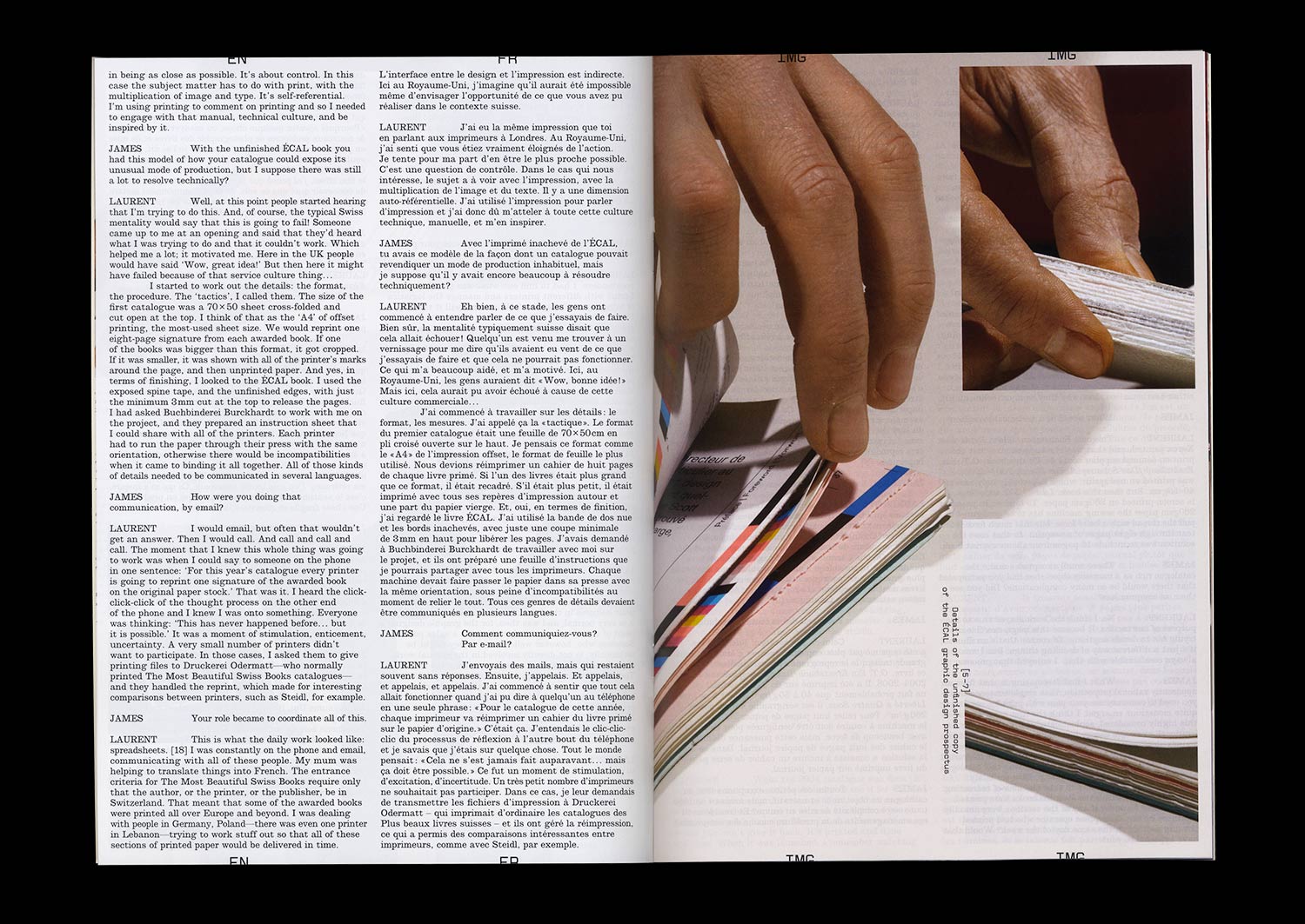
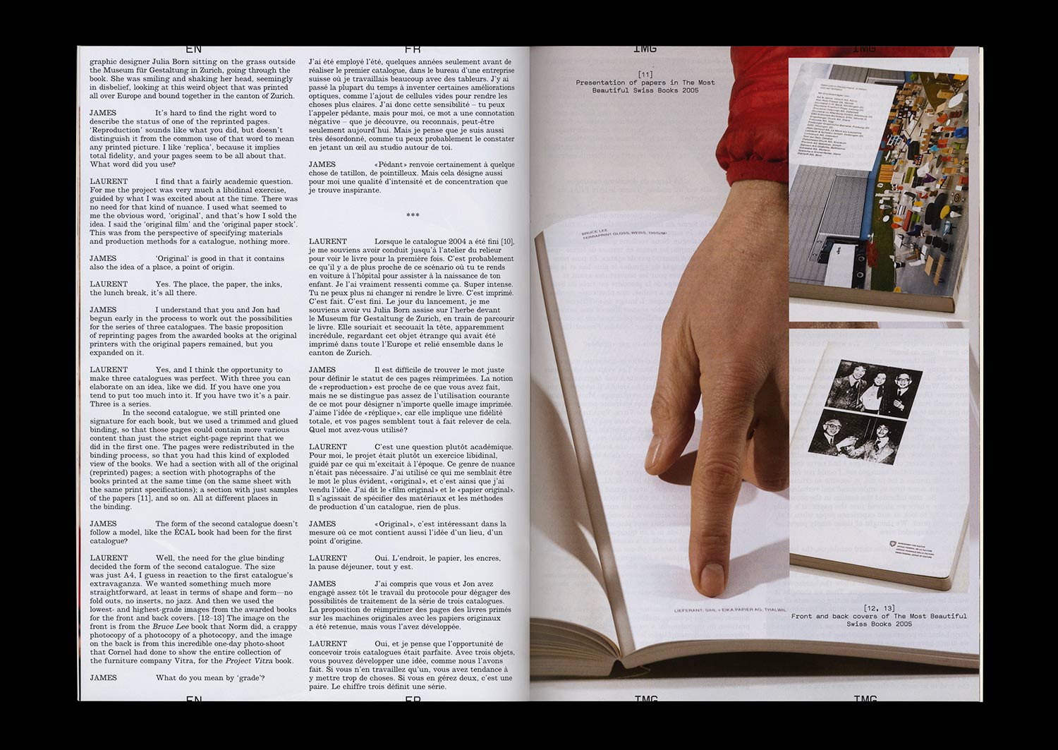
The 2004–2006 catalogues were conceived by Laurent Benner, a Swiss designer working in London, and designed with English designer Jonathan Hares. Laurent’s proposition for the 2004 catalogue was audacious. He contacted the printers of each of the 20 awarded books from that year and asked them to reprint a section of their book. These reprinted sections were then transported to a single Swiss bookbinder and bound, with some additional pages of front- and back-matter, to comprise the catalogue.
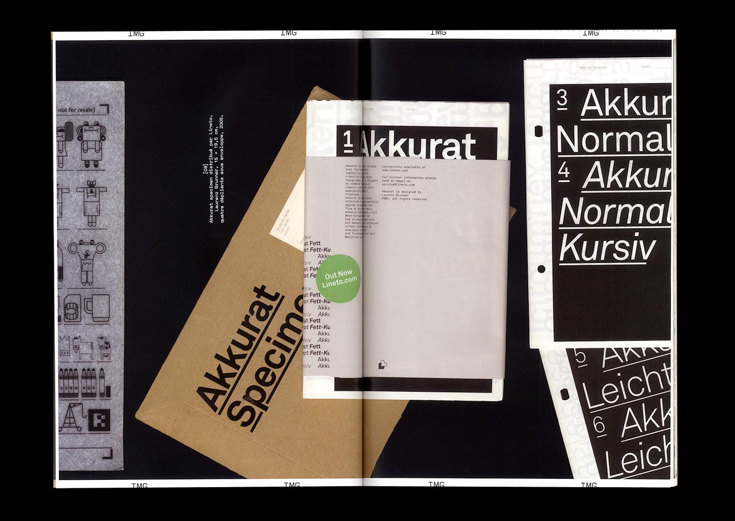
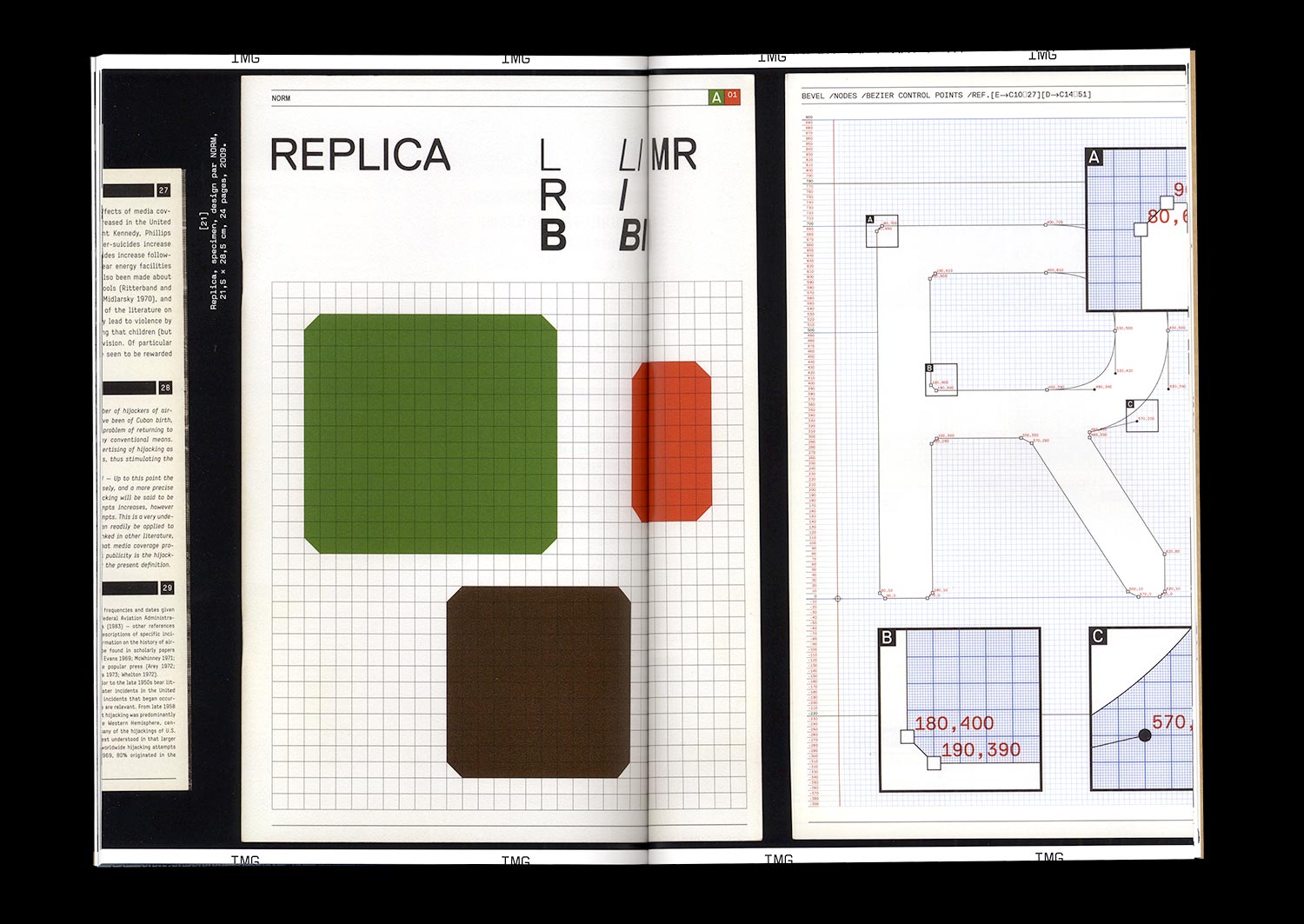
n°30 — Types of types: the typographic specimen by Lineto. Author: Olivier Lebrun
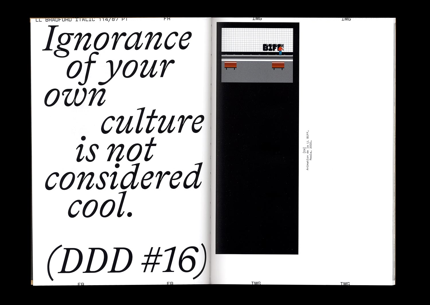
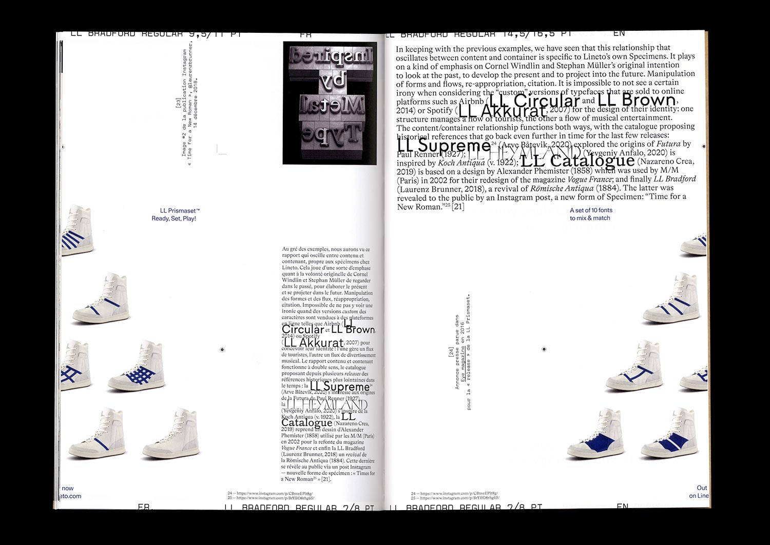
For Lineto (https://lineto.com) the Specimen plays out through forms and formats in order to promote the foundry’s typefaces: books, posters, envelopes, pamphlets, letter transfers, print ads, and video clips as well as inflatable structures and bootlegs of logotypes. When Reala published LL Biff in 2000, the specimen employed graffiti culture and its modes of distribution, along with a combination of two references: “Medium is the message”*, “Style is the message”**. For Lineto the citation is a form that allows them to distribute their typographic catalogue while promoting diverse cultural fields: “Ignorance of your own culture is not considered cool!”***