Season 1, 1st to 15th issue
English/French
210 × 297 mm, 20 pages sometimes more
CMYK and sometimes more, Saddle stitched binding
Design: Syndicat
2017-2018
7€ per issue or 90€ the subscription
Season 1, 1st to 15th issue
English/French
210 × 297 mm, 20 pages sometimes more
CMYK and sometimes more, Saddle stitched binding
Design: Syndicat
2017-2018
7€ per issue or 90€ the subscription
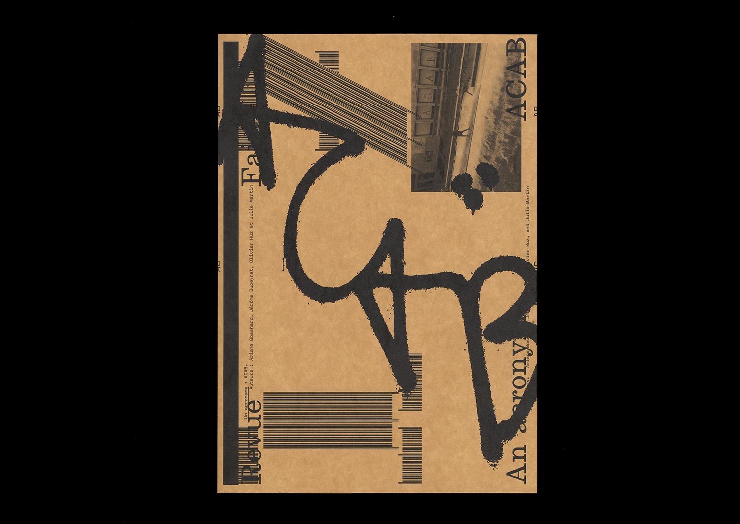
n°17 — An acronym: ACAB. Authors: Ariane Bosshard, Jérôme Dupeyrat, Olivier Huz and Julie Martin
Authors: Ariane Bosshard, Jérôme Dupeyrat, Olivier Huz and Julie Martin
20 pages, 21 × 29,7 cm, CMYK
26th November 2019
ISBN: 979-10-95991-15-1
ISSN: 2558-2062
Authors: Ariane Bosshard, Jérôme Dupeyrat, Olivier Huz and Julie Martin
20 pages, 21 × 29,7 cm, CMYK
26th November 2019
ISBN: 979-10-95991-15-1
ISSN: 2558-2062
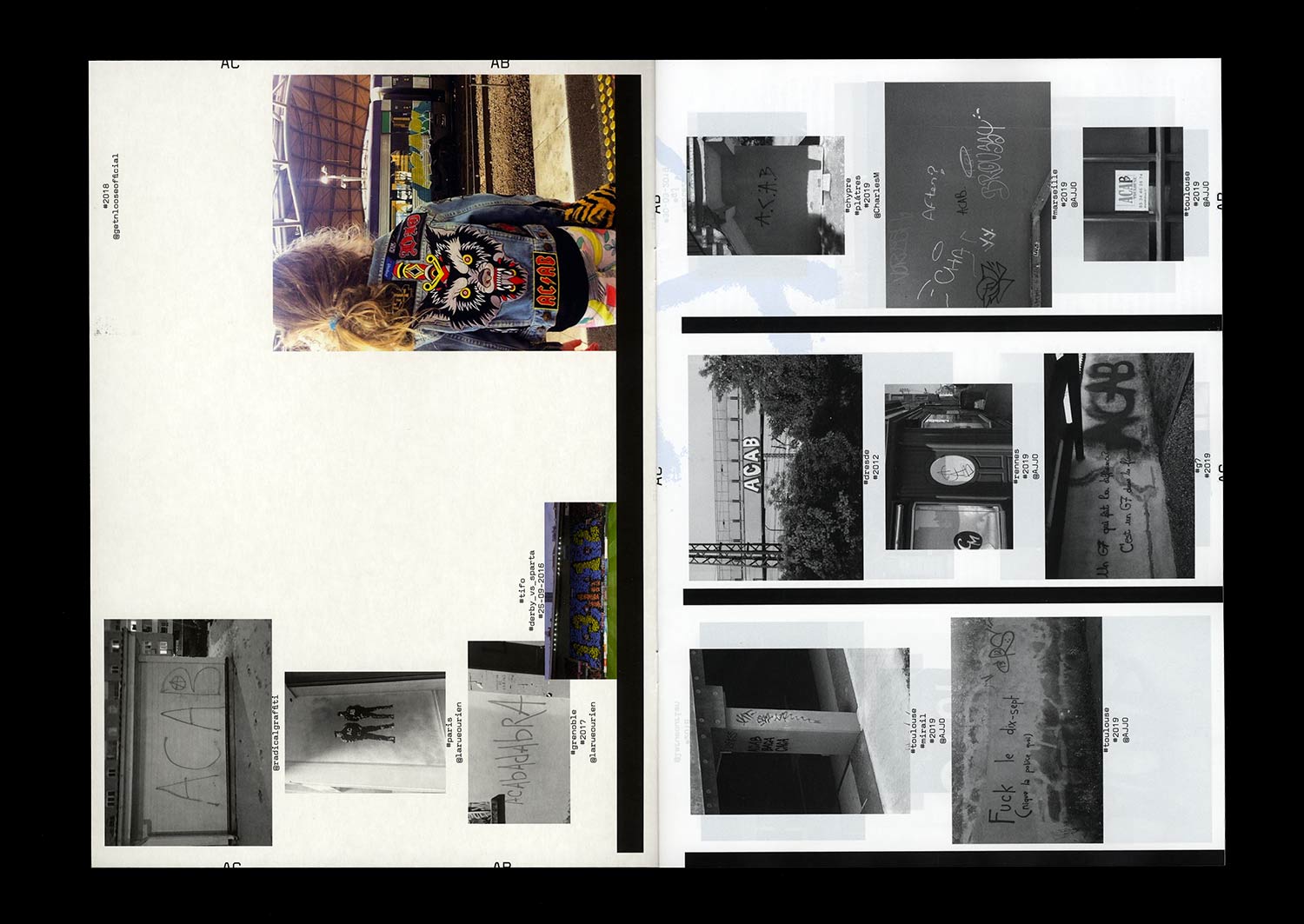
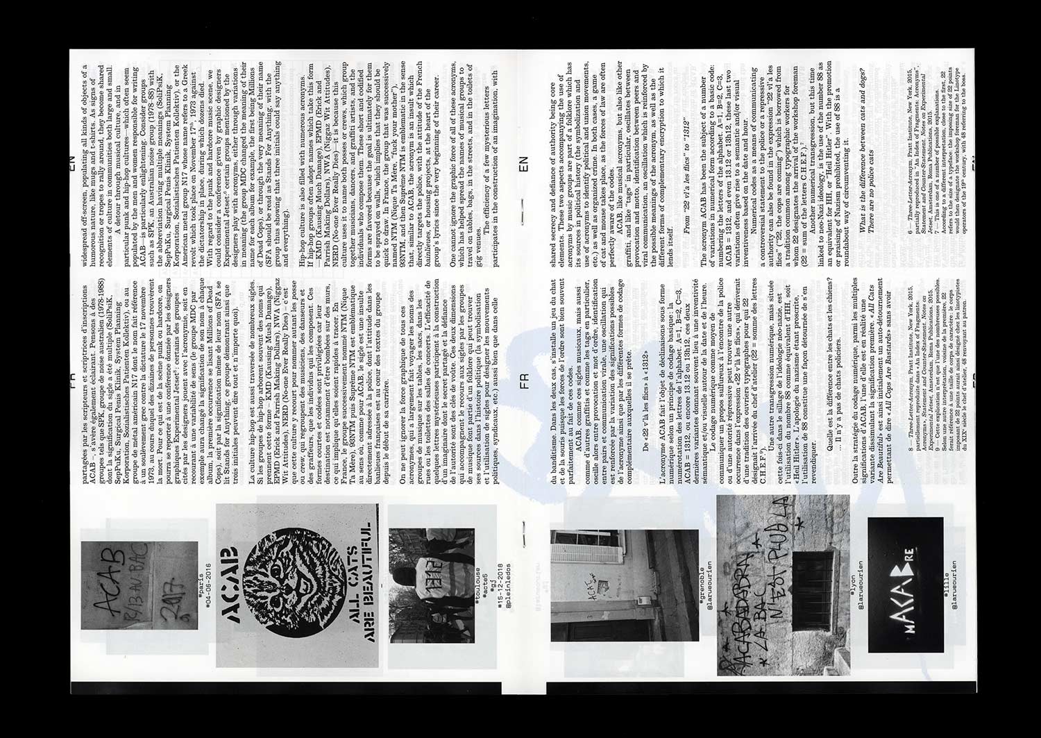
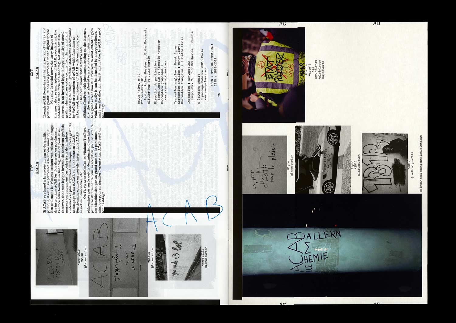
The acronym ACAB, often seen in urban space in the form of graffiti or stickers, first appeared in the U.K. in the 1970s, linked to punk culture, and later found a certain popularity during the social movements of the 1980s. Meaning “All Cops Are Bastards”, over the last 20 years it has become widespread in public spaces internationally, in the wake of a number of political movements, from alter-globalization groups to the French gilets jaunes, or Yellow Jackets, along with black blocks and TAZs, even spawning different variations, such as “All Capitalists Are Bastards”, “All Colors Are Beautiful” and “All Cats Are Beautiful”.
Observing how ACAB (or its numerical version, 1312) is written, allows one to traverse multiple political landscapes, as well as a number of visual cultures (anarchist, punk, hip-hop, LOL) to which this acronym has spread. It is through this scriptural, graphic and visual movement that it has become both a sign of recognition and a polysemic statement.
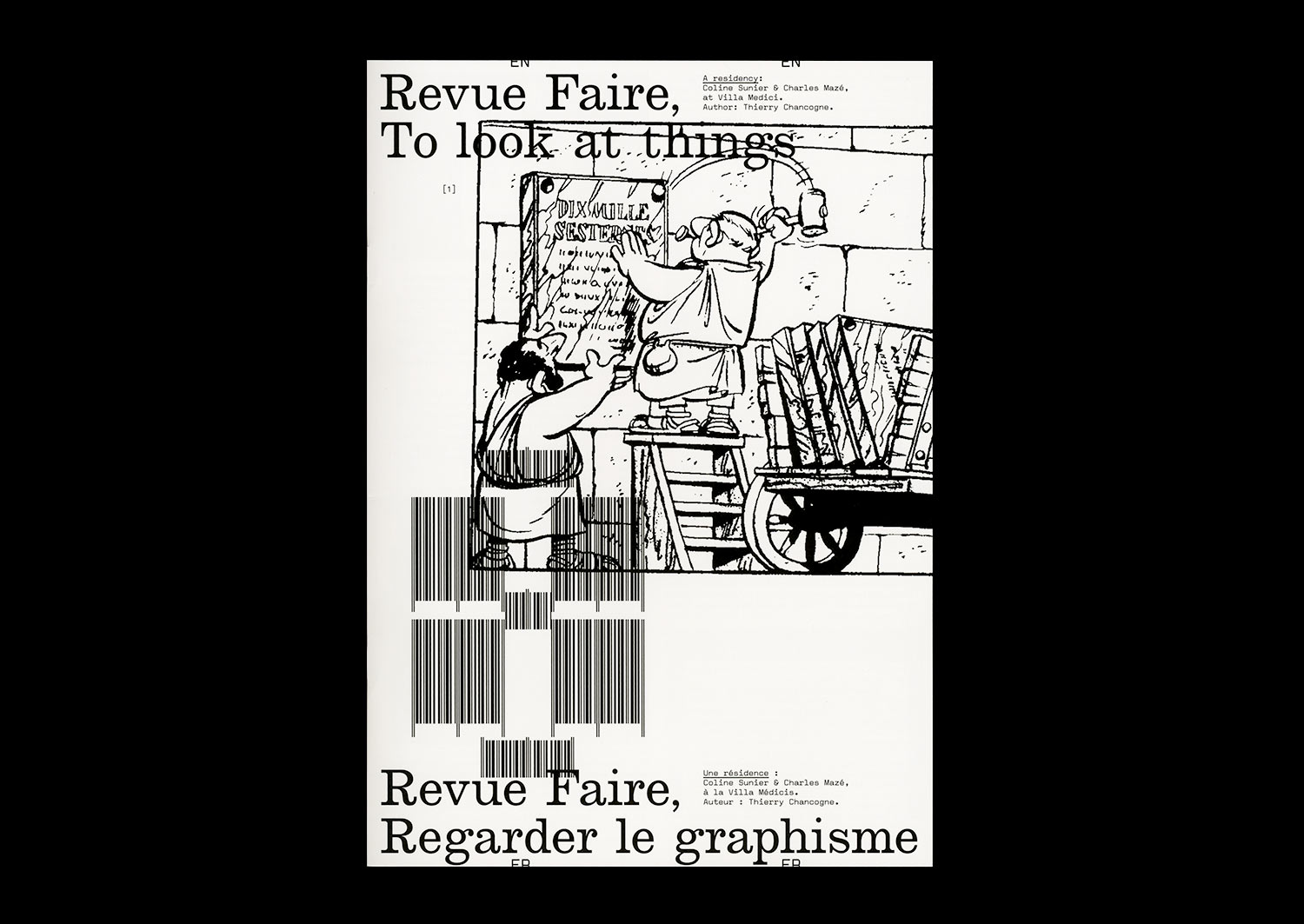
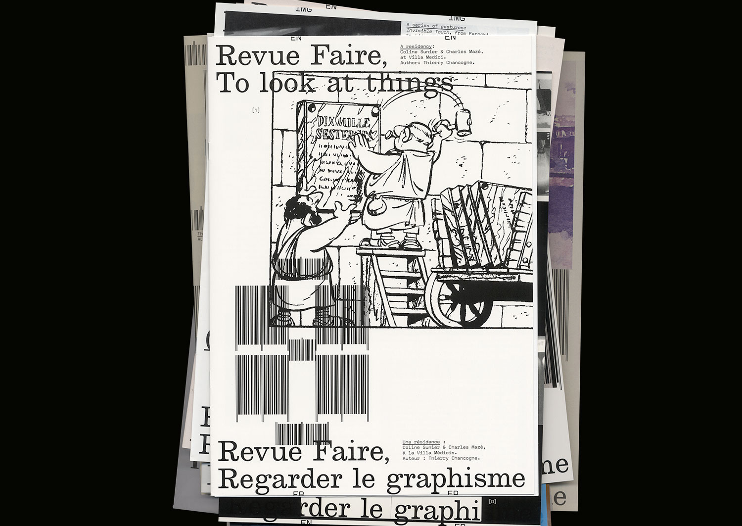
n°08 — A residency: Coline Sunier & Charles Mazé at Villa Medici. Author: Thierry Chancogne
Interview with Coline Sunier & Charles Mazé by Thierry Chancogne
20 pages, 21 × 29,7 cm,
07 February 2018
ISBN : 979-10-95991-05-2
ISSN : 2558-2096
Interview with Coline Sunier & Charles Mazé by Thierry Chancogne
20 pages, 21 × 29,7 cm,
07 February 2018
ISBN : 979-10-95991-05-2
ISSN : 2558-2096
Typo-topographic records
While still a student in the Ésad Valence, Coline Sunier, along with Grégory Ambos, created a striking front cover for the booklet associated with the Zak Kyes programme, Forms of Inquiry, using a series of jewels sampled from the more or less heraldic graphic patrimony of highly local emblems.
When she founded her studio with Charles Mazé, the duo continued the work of collection, which is at the same time one of the etymologies of reading, and one of the characteristics of the conceptual aesthetic of the list that emerged in the 1970s—first, in the re-casting of the Ésad Valence’s identity in 2012-2013; then in the work created during a residency at the Villa Médicis, Come vanno le cose?, dedicated to records of 1,512 graffiti found on the walls of Rome illustrating the portrait of a mysterious survivor, perhaps imagined, of the Red Brigades; and more recently in the identity developed for the Centre d’art contemporain in Brittany.
The collection of signs of power and the traces of resistance profoundly inscribed in the always political matter of the spaces is often accompanied by an attempt at typographic translation bringing to mind the work of typification in the personal writings of Fernand Baudin, created for the catalogue of the eponymous prize in 2012.
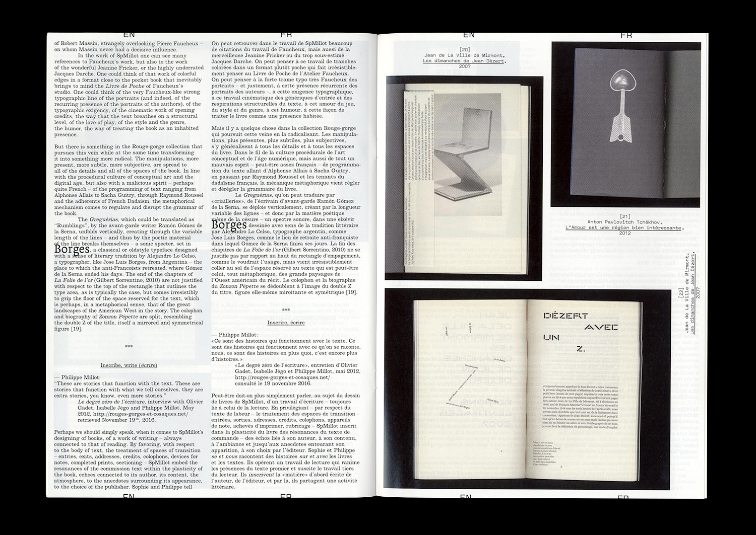
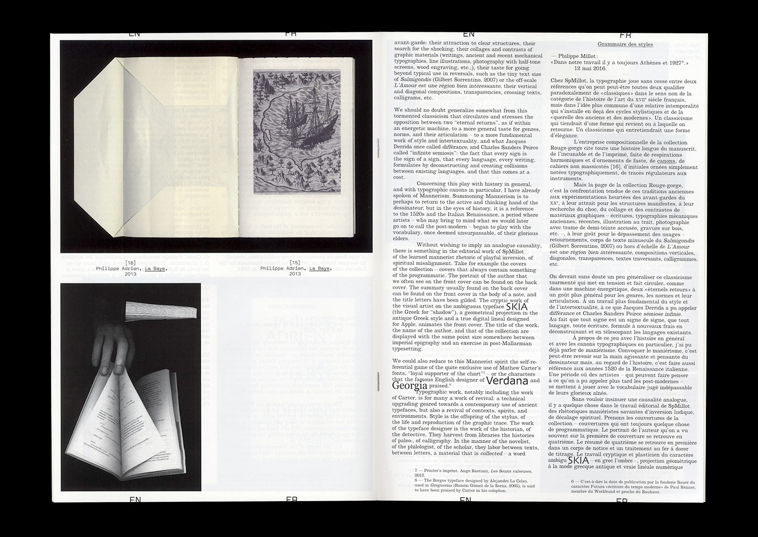
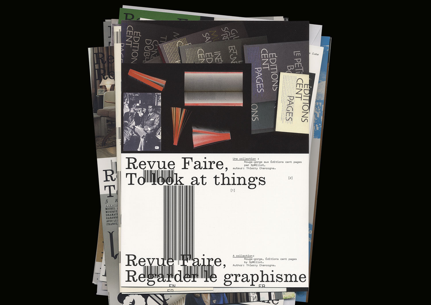
n°01 — A collection: Rouge-gorge, Éditions Cent pages by SpMillot. Author: Thierry Chancogne
Author: Thierry Chancogne.
20 pages, 21 × 29,7 cm, CMYK
25th Octobre 2017
ISBN: 979-10-95991-04-5
ISSN: 2558-2062
Out of stock
Author: Thierry Chancogne.
20 pages, 21 × 29,7 cm, CMYK
25th Octobre 2017
ISBN: 979-10-95991-04-5
ISSN: 2558-2062
Available only with the Season 1 subscription